Exhibitions
Evelyn Hofer at the Photographers' Gallery
|
|
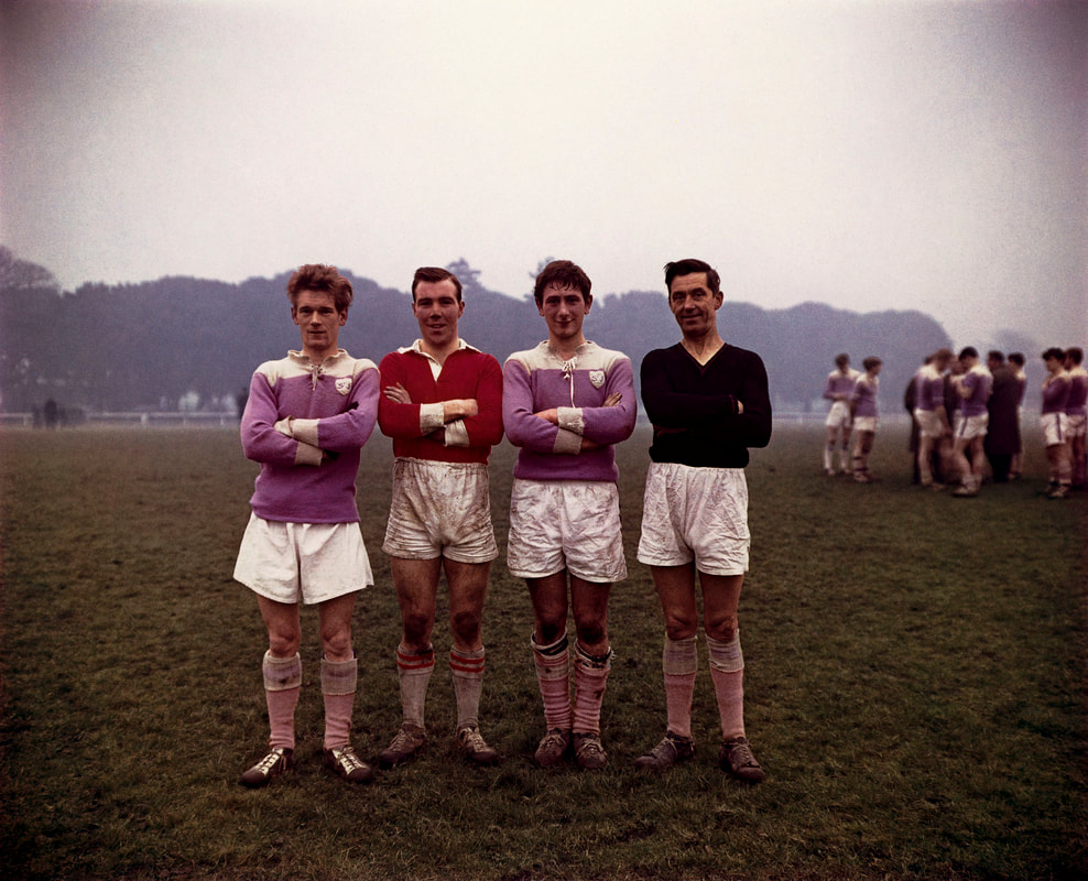
Elevyn Hofer (1922-2009) was a German-American photographer who achieved esteem during her career as a photographer, and as one of the pioneers of colour photography alongside her contemporary Saul Leiter.
The exhibition was a major retrospective which spans 45 years of image-making, featuring over 110 black and white and colour images, as well as ephemera and books.
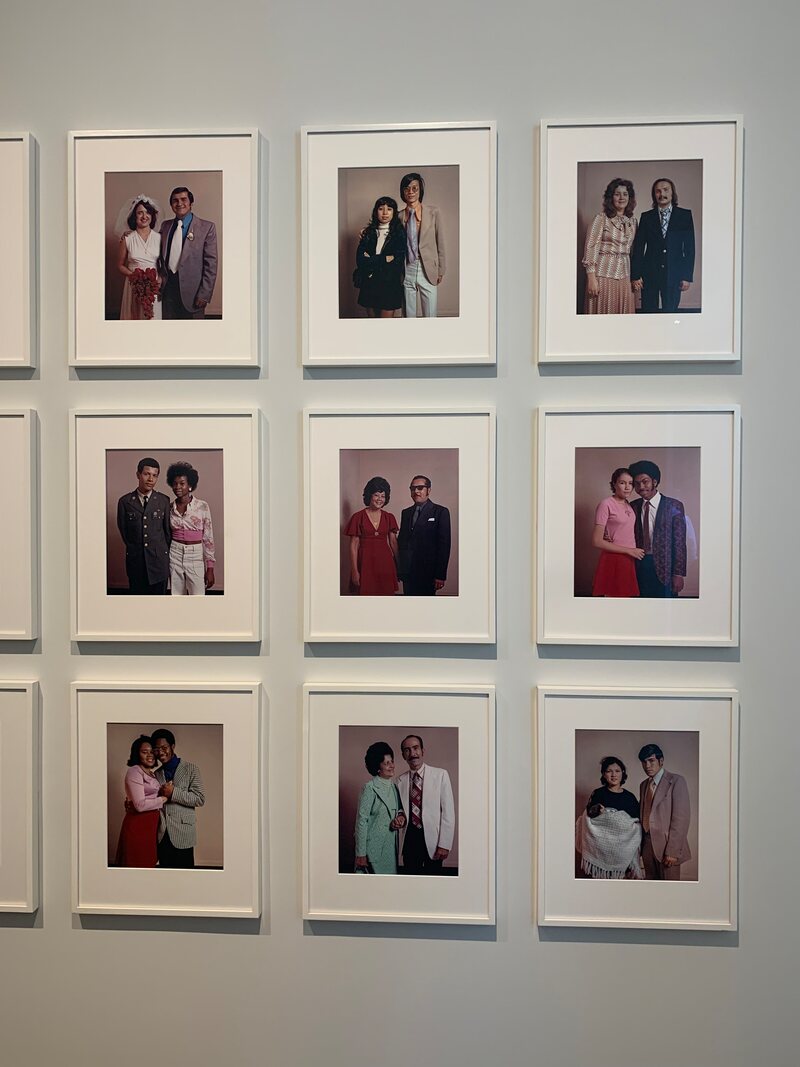
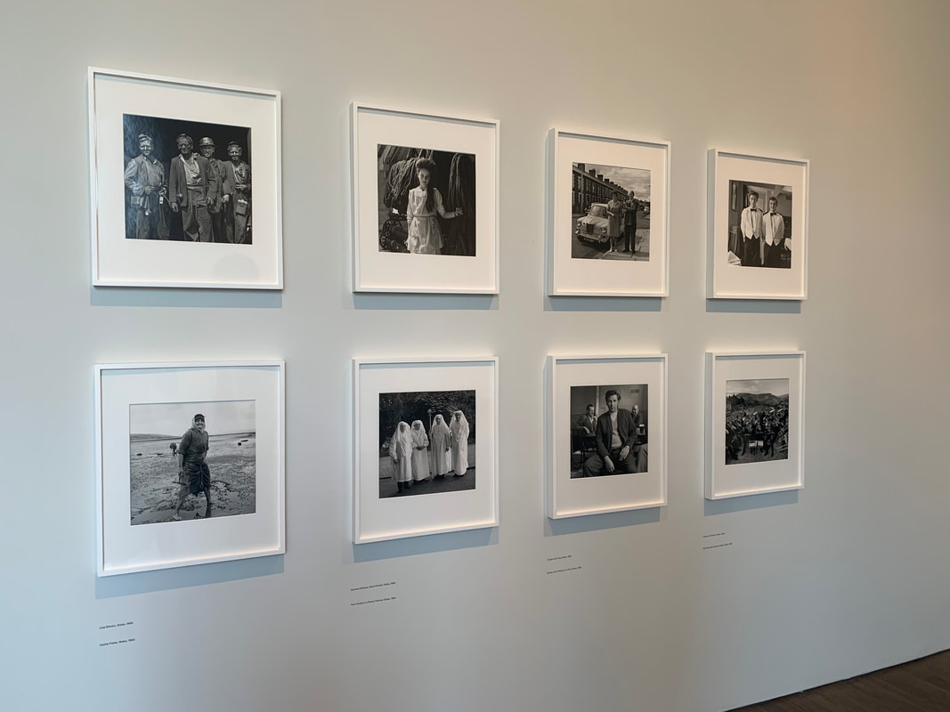
In terms of structure, the showing began with Hofer's landscapes, cityscapes and characterful portraits. These gave a grounding in Hofer's interest in changing social and political landscapes, shown by her equality of subject choice, from gravediggers in Dublin to Joint Chiefs. Upstairs, her 'Just Married' (1974) series was showcased, which had been printed in Life Magazine. We see more street portraits, only in colour now, reflecting her switch to a complex colour dye transfer printing process. Finally, there is her still-life series, produced in the mid-1990s, heavily influenced by an admiration for Renaissance painting.
The exhibition was a major retrospective which spans 45 years of image-making, featuring over 110 black and white and colour images, as well as ephemera and books.
In terms of structure, the showing began with Hofer's landscapes, cityscapes and characterful portraits. These gave a grounding in Hofer's interest in changing social and political landscapes, shown by her equality of subject choice, from gravediggers in Dublin to Joint Chiefs. Upstairs, her 'Just Married' (1974) series was showcased, which had been printed in Life Magazine. We see more street portraits, only in colour now, reflecting her switch to a complex colour dye transfer printing process. Finally, there is her still-life series, produced in the mid-1990s, heavily influenced by an admiration for Renaissance painting.
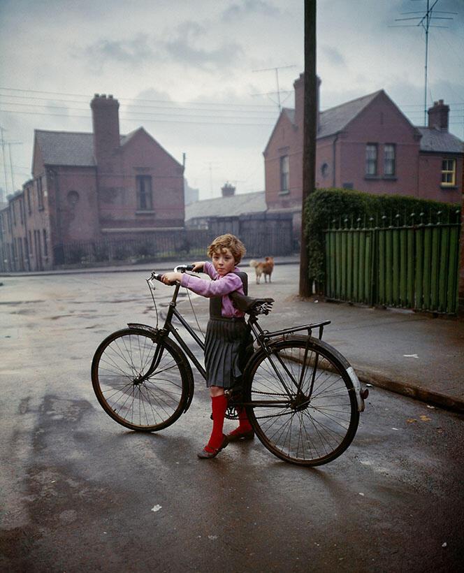
'Girl with Bicycle, Dublin', 1966
I liked that this photo seemed to be at once a portrait and a landscape. Hofer's attention to composition is clear here, reflected in the way in which she would meticulously set up scenes to her liking. The girl seems at once dwarfed by the empty landscape as she does fitting into her environment.
|
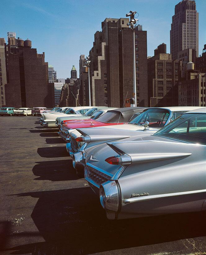
'Car Park, New York', 1965
The intensity and vibrancy of Hofer's colours are even more striking when seeing the work in person. I picked this photo for that reason. I found it interesting that the images taken in New York are vibrant and full of life, whereas her photos in Dublin seem to have a more muted sheen.
|
'Phoenix Park on a Sunday, Dublin', 1966
This image seems to emphasise the importance of a complicity between the photographer and their subjects. Grafik describes pinpoints the 'slight glint in their eyes, as if they know they are performing for her camera'. You can see that the subjects are reacting to Hofer's unassuming presence as a photographer.
|
Overall, I liked the sensitivity of Hofer's portraits. Her work, interestingly, differs from her contemporaries who were practising street photography with a 'shoot-from-the-hip' style in which brief moments were captured. Hofer instead took the time to set up her subjects how she wished, sometimes even noting a certain time of day and returning again in accordance. This gives the photos a quiet stillness, seeming more of a study into the subject and their environment of which the photographer was not invading, but documenting.
'Home is not a Place' at the Photographers' Gallery
|

|
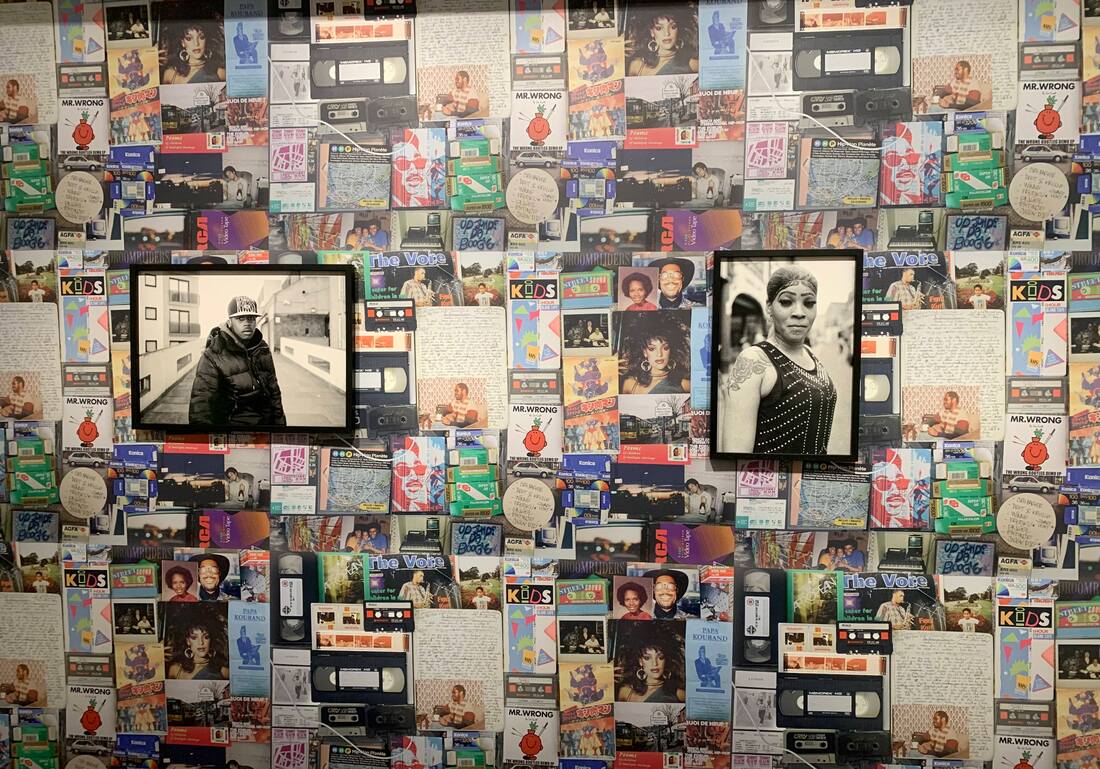
This exhibition was the product of a journey across the British coast in search of an answer to the question 'What is Black Britain?'. Photographer and writer Johnny Pitts and poet Roger Robinson completed this project in 2021. The show's title comes from a quote by American writer James Baldwin 'perhaps home is not a place, but rather an irrevocable condition'.
|
When entering the gallery space, you are introduced to isolated vignettes into people's lives in different areas - from a schoolboy with a basketball to a climate activist holding a poster. On a large wooden table in the centre of the space is a collection of printed photos in an album - resembling that of a family photo collection, inviting you to flick through. A whole wall is dedicated to a patchwork of posters and images from popular culture, such as icons from Pitts' 1980s youth. Entering the next space, Pitts has created a home-like space, including a set of shelves with a DVD collection, a small TV, a coffee table and a large sofa. Finally, the show ends with some more contemplative images which experiment with light, such as the one on the right.
|
|
All photos from 'Home is Not a Place' 2021-22
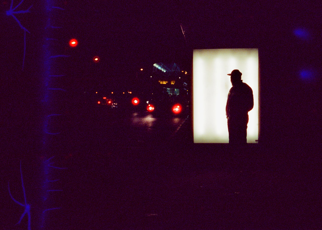
Initially what drew me to this photo was the use of city night lighting - capturing something magical within an otherwise ordinary scene. Upon further research, I discovered the poem that accompanies the image. This quote struck me - 'the city's silhouettes emerge, reaching outstretched to the heavens' - as it reflects the photographer's job in transforming the mundane into the epic, the mystical.
|
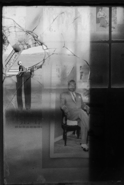
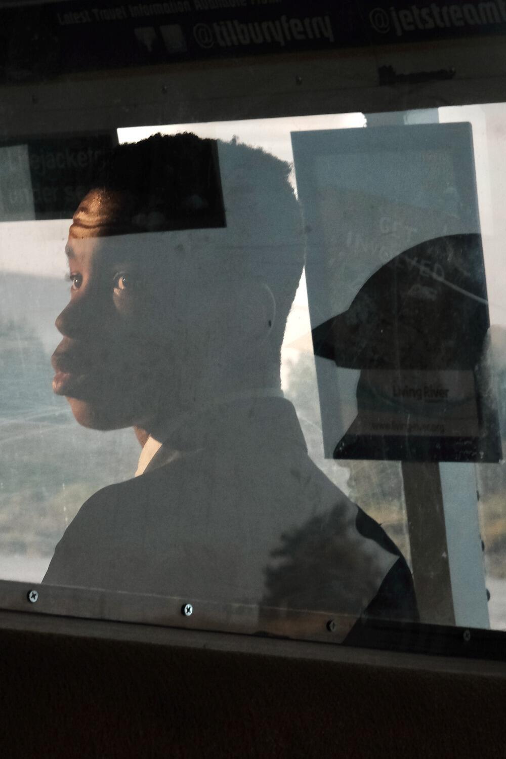
This photo stood out to me as it was different from the others. Aside from being in black and white, it differs from the other more straight-forward portraits. In fact, this photo could be argued to be a portrait of to different people. Pitts' use of the glass skews our idea of proper portraiture and seems to invite questions into identity.
|
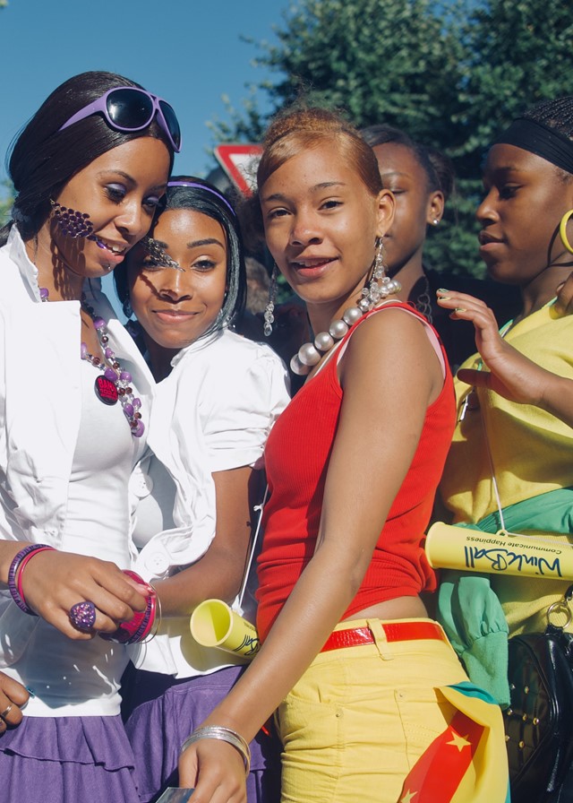
I chose this image as I like the vibrancy of the colours as well as Pitts' composition - the subjects are almost layered on top of one another, creating a bustling feeling The atmosphere of positivity is clear, reflecting Pitts' style of capturing spinets of people's lives
|
The exhibition's themes of the home and everyday experience which shape our lives was something I will take from it, as well as the role of the photographer in documenting small slices of lives that we would otherwise never feel a part of.
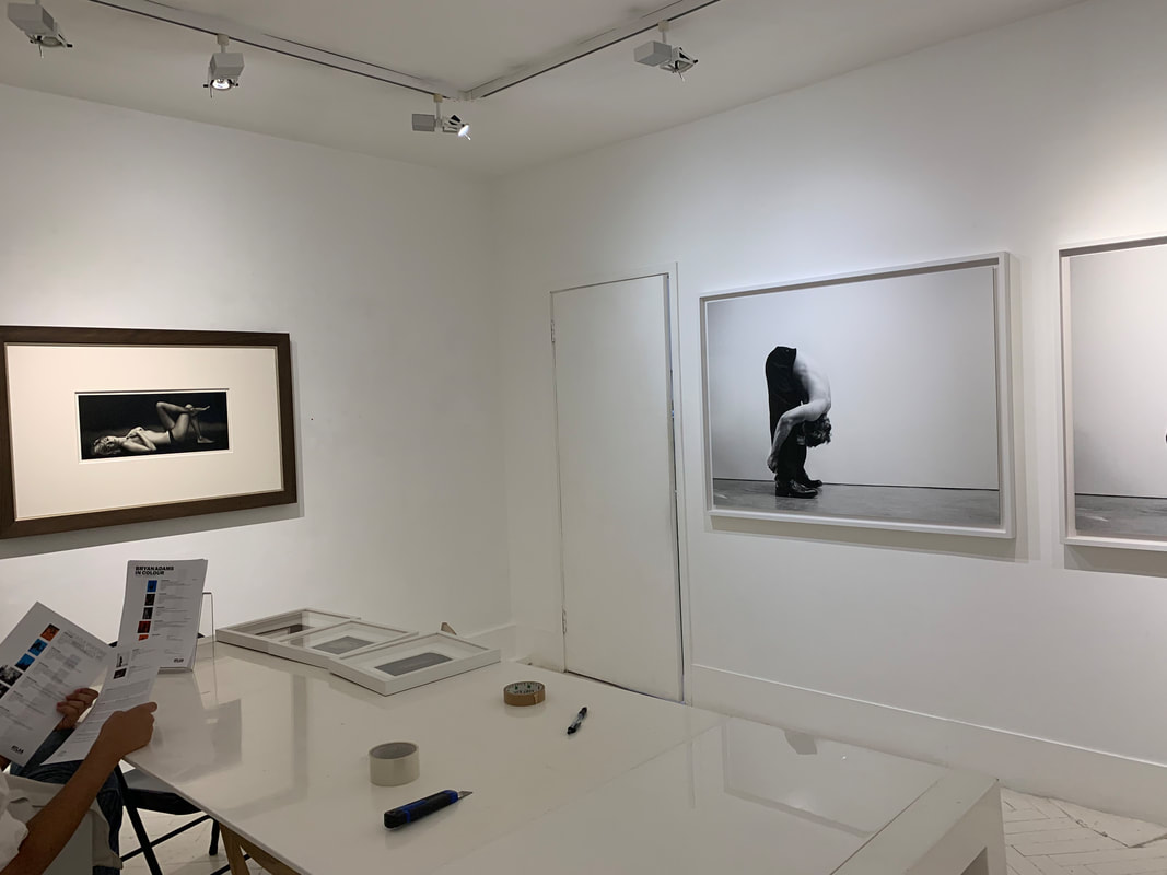
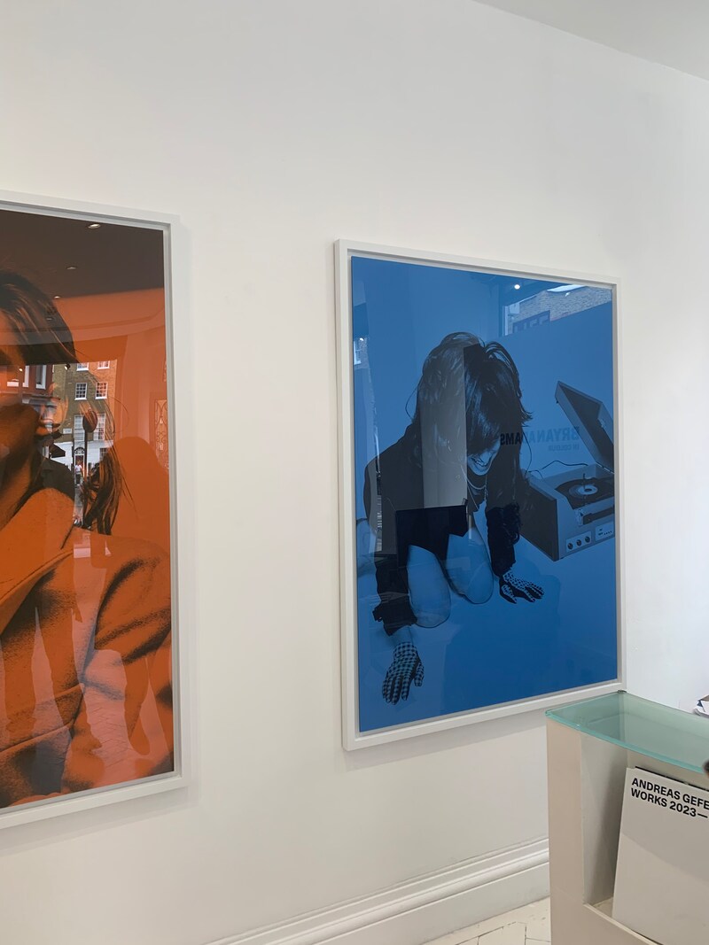
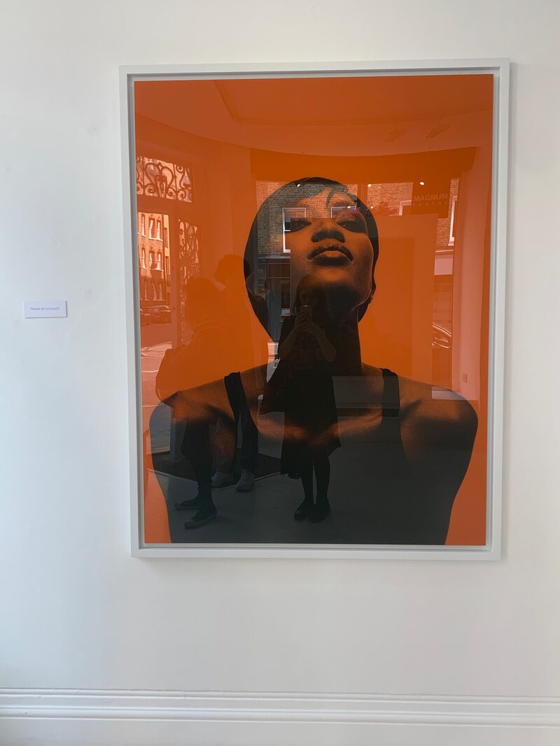
Bryan Adams in Colour at the Atlas Gallery
|
|
|
The exhibition was of new photographic works by photographer and singer Bryan Adams. Adams was inspired by the expression 'seeing things through rose-tinted glasses'. He decided to experiment with multi-coloured plexiglass, giving a fresh perspective to Adams' catalogue of portraits including Kate Moss, Amy Winehouse and Mick Jagger.
Bryan Adams himself is a self-taught photographer, who became professional in the mid-1990s. He chooses to photograph the times' most admired creatives, models and actors, not to mention the Royal Family, of which one of his portraits is hung in the National Gallery.
Bryan Adams himself is a self-taught photographer, who became professional in the mid-1990s. He chooses to photograph the times' most admired creatives, models and actors, not to mention the Royal Family, of which one of his portraits is hung in the National Gallery.
When entering the gallery, the coloured photographs are presented first, the celebrities hung in dreamlike suspension. Downstairs are displayed some black and white portraits, a bit more experimentally shot.
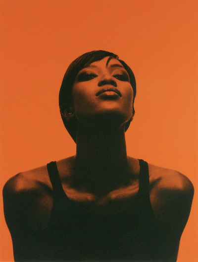
Naomi Campbell, Tank Top, London, 2000
This is one of the first photos that I saw. The orange tint really compliments the black and white photograph behind it, giving an almost artificial feel. This reflects Adams' idea of the sense of the celebrity as being viewed behind a screen. The photograph was framed, again creating that distance between the celebrity and the viewer, like the distance between the viewer's idea of a celebrity and their reality.
|
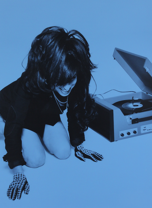
Amy Winehouse, Spinning Records, London, 2010
I liked that this photo seemed to capture some of the relationship between the photographer and the subject. Adams says that he was always fascinated by those who took his picture for album covers and magazines. To flip roles like this gives Adams' photos a feeling of the understanding of being on both sides of the camera.
|
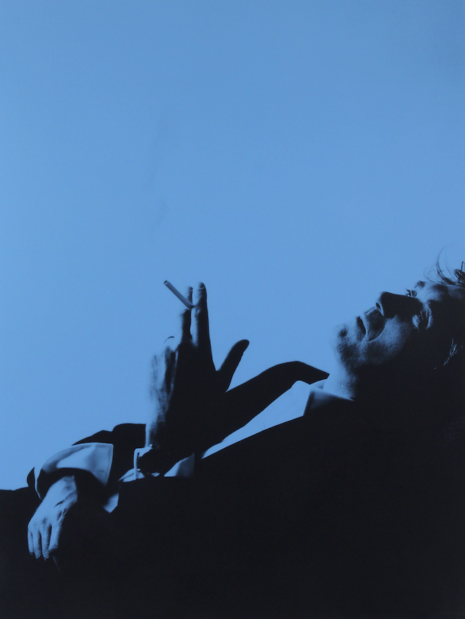
Bryan Ferry, Smoke, London, 2000
This photo, hung across diagonally from Winehouse's portrait, seems to contrast drastically in mood. The blue colouring adds to the contemplative posing. Here, we see more of Adams' negative outlook on celebrity culture. The photos are like looking through a filter ensnaring the celebrity subjects. Adams states that 'They're sort of trapped', but also that this did not completely reflect his intentions, rather he liked more that 'it gives them a more Pop-art feel'.
|
Mainly, I liked the technical aspect of Adams' photography. Adams had thirty different plexiglass manufacturers consulted before he found the one he wanted. Colour adds a graphic element to the portraits, making the people into 'subjects' or even objects rather than humans, reflecting ideas about celebrity culture and its sometimes de-humanising impact.
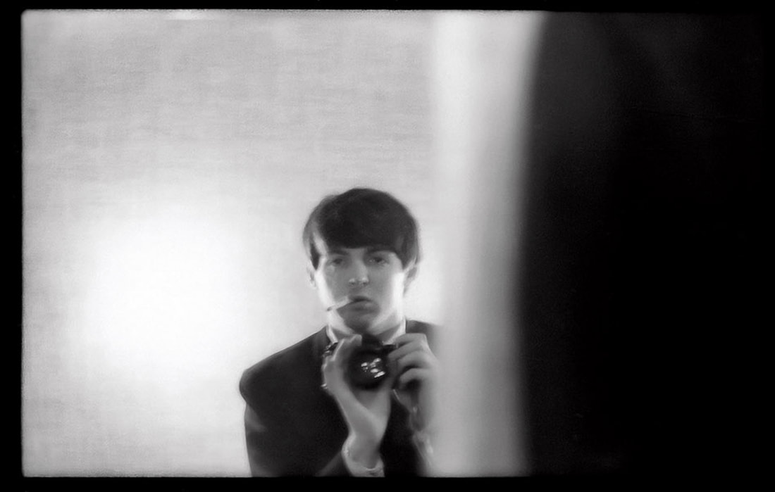
Paul McCartney Photographs 1963-64: Eyes of the Storm
This exhibition at the National Portrait Gallery focuses on portraits captured by McCartney between December 1963 and February 1964 using his own camera. The images offer a uniquely personal perspective from the inside of the band creating cultural history during the 'Beatlemania', depicting what it was like to be a 'Beatle'. The title of the exhibition itself highlights how the images offer an insider outlook which contrasts to the immense amount of outside media involving the band at the time. This is demonstrated in the images of each airport which the band visited. McCartney turns the camera on the airport workers, the police and the press photographers, subverting the enthusiastic reception which the band received in each new place.
The camera used is a Pentax 35mm single-lens reflex camera. This lightweight camera was easy to use and easy to carry, allowing McCartney to capture the fast pace of his new life in the spotlight.
The structuring of the gallery space follows the band's progression as they transformed from local to global phenomenon. The first set of images in the UK remind McCartney of their early concerts and original fans. He feels that the images capture a 1960s London which was full of 'promise and ambition and everything new to four young men from the North'. Later on, the band goes on their American tour, documented in shots outside of car windows, emphasising their positions as tourists in a new place and their still innocent curiosity. For example, McCartney compliments his image of a gun with his comment that 'it was still slightly shocking for us to see a gun in real life'.
|

|
Photo Focus
|
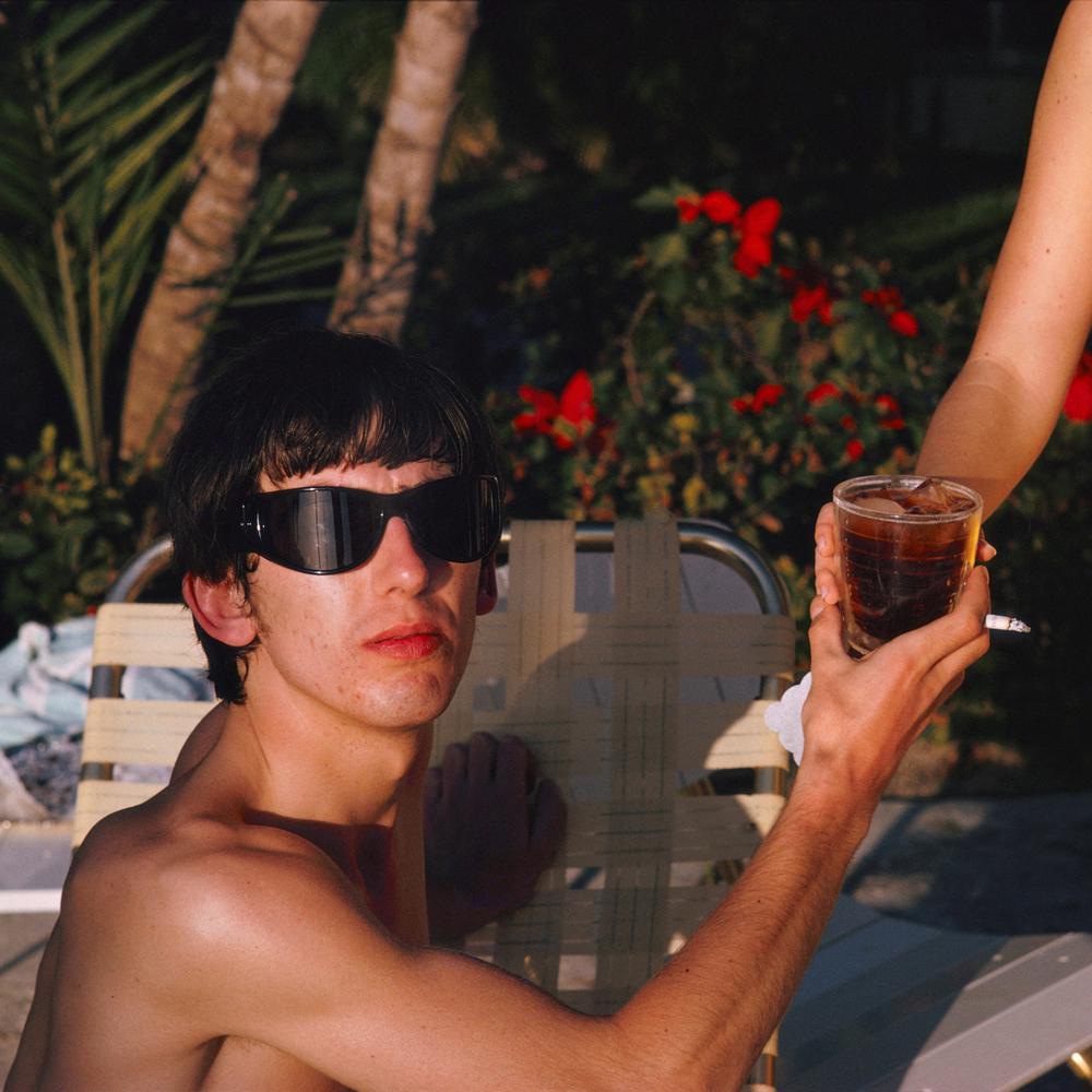
As the exhibition progressed, we see the Beatles arrive in Miami, Florida. For this series, McCartney switched to colour film, capturing the bright skies and vibrant colours of the new place. The images from Miami document the band's few days off, giving a more intimate insight into their lives, and less of a serious look - holiday snaps rather than studies in documentation. The switch to colour also reflects the change in the band members' lives which would change their world forever.
|
Word List
When looking through my website, I looked at the abstraction project and picked out these words which came to mind, either from the ideas I gathered after responding to work, or feelings and themes that spring up from my own work.
Perspective
Distorted
Nature
Psyche
Confusion
Blurred/softness/subdued
Elemental
Solitude/alienation/detachment
Pathos
Visceral
Community
Culture/media
Other-wordly/unease
Violence
Realistic/literal/artificial
Comparisons/parallels
Textures
Imperfection/perfection
Humanity/emotion/personal
Hope
Dreams/alternate reality/fairytale
Intrigue
Trickery
Freedom
Distorted
Distortion could mean experiments with photographic techniques - deforming photos through the use of props like glass, mirrors, or through editing. It could also reflect wider ideas of the camera's ability to distort reality, people's perceptions, or appearance vs. reality.
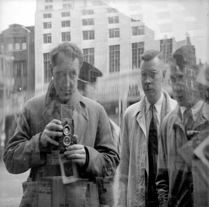
Nigel Henderson's Reflections
Nigel Henderson was an English documentary artist and photographer. Henderson took up photography after serving as a pilot during the Second World War, teaching himself as photography did not yet exist as part of the curriculum.
|
|
|
His portraits of himself or other figures using a medium through which distortion may take place - a window, a sheet of glass - reflect his interest in experimenting with new photographic techniques, for example, his invention of 'stressed images', where he stretched printing paper while enlarging it. While visiting Paris in the 1930s, Henderson was exposed to and inspired by surrealist artists, the influence of which is clear in his creation of deformed and misshapen visuals.
His introspective work often links to his traumatic experiences of conflict and relates more widely to a period tinged by fear of possible nuclear threat, shown by the unsure atmosphere created by his malformed faces.
His introspective work often links to his traumatic experiences of conflict and relates more widely to a period tinged by fear of possible nuclear threat, shown by the unsure atmosphere created by his malformed faces.
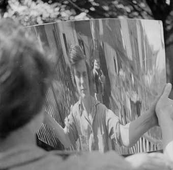
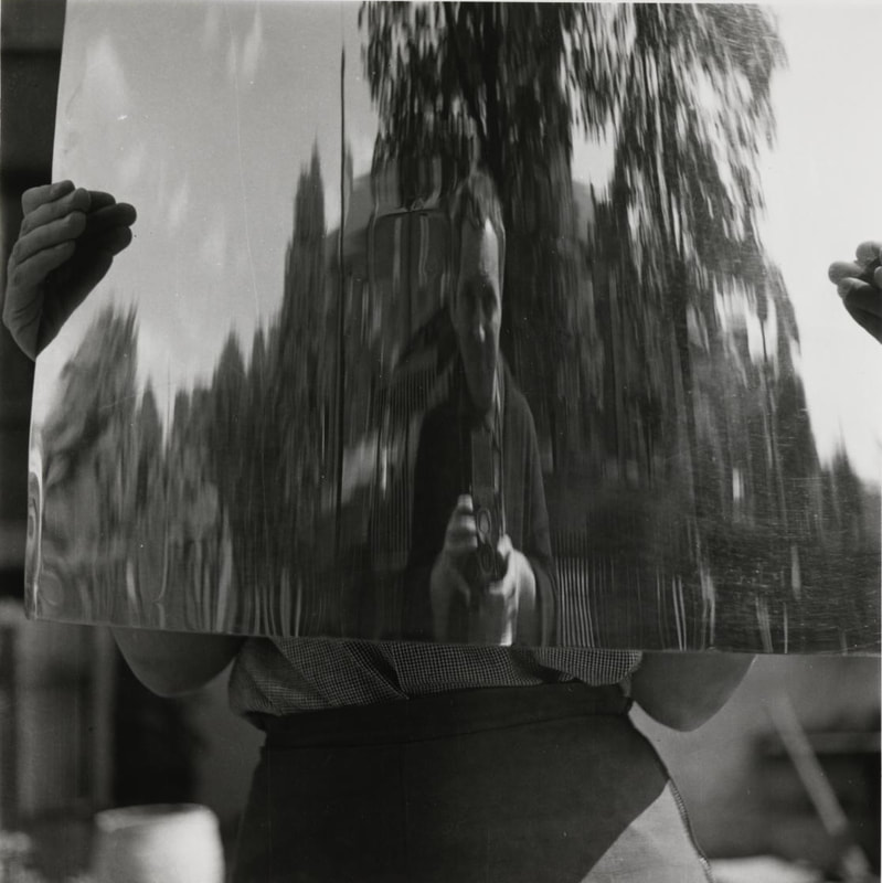
In response, I decided to focus on windows. I tried to capture reflections of passers-by as well as myself and my camera when they came into conflict with the window frame to mimic the technical aspect to Henderson's work.
Edits


|


|
I found that perfecting the technical aspects when taking these was difficult. Often I found that the photos were slightly soft, or blurry, as is the nature of reflections.
I liked the concept of having two different but parallel visual stories overlap, as well as the way in which the movement of the passers-by was frozen into a new photo that I had created. It was difficult to predict how the images would turn out as people kept passing by quickly, but I liked this element of randomness and chance.
If I were to develop on these, I would try to perfect the technical aspects and take more photos on a sunny day, as the lighting was dim due to the weather that day. I feel as if stronger lighting would also sharpen and brighten the images.
Contrast
For me, contrast could mean an array of things for this project. In terms of photographic techniques, contrast could be in terms of lighting, textures or the use of colour. But it could also mean composition - juxtaposing two opposites in one frame. It could mean contrasting ideas - night vs. day, colour vs. black and white, old vs. young...
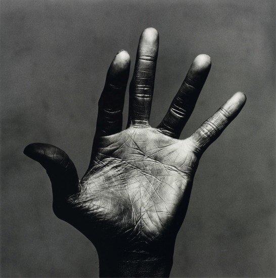
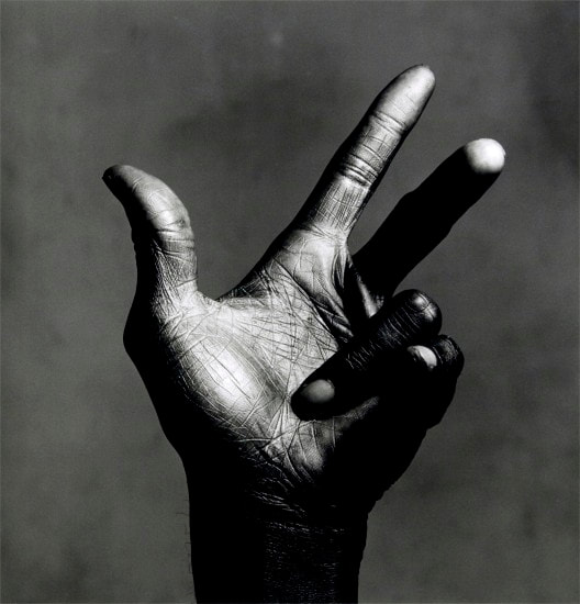
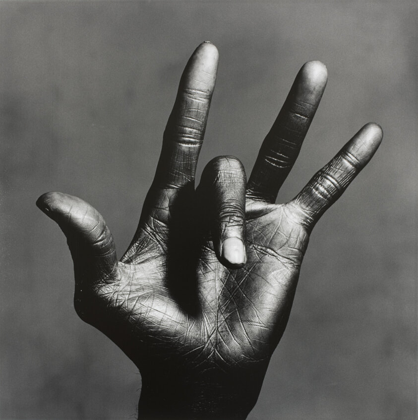
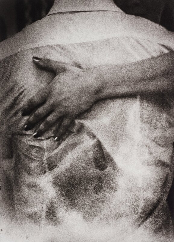
Irving Penn - Hands
'The Hand of Miles Davis C New York', 1986
|
|
|
Irving Penn was an American photographer known for his fashion photography, for example, a long career with Vogue, as well as his portraits and still lifes.
Penn believed that taking portraits was an act of respect and emotional intimacy. He states that it is 'a moving experience for the subjects themselves, who without words by only their stance and their concentration were able to say much that spanned the gulf between our worlds.' It is interesting then, considering this element of mutual communicaton, that Penn decided to take a more experimental approach to photographing Davis through eliminating his face entirely. In a way, through showing something unexpected, the sensitive nature of the portraits is heightened.
In order to achieve the intricate tones and shines that are clear in these works, Penn investigated nineteenth-century methods that could offer greater control over the subtle variations and tonalities he sought in a print. He pressed on with his investigations until he perfected a complex process for printing in platinum and palladium metals. The deep depths and blinding heights of light in these images transfer the hands into a kind of landscape, something other, something higher than just their corporal presence.
Before the portraits were taken, Penn had asked Miles Davis to take off his jewellery, upon which his focus was drawn to his hands. The photos clearly tell a story of the power and talent of the musician, with certain fingers almost reaching as if it play the key of an invisible instrument.
I decided to respond to Penn's work as I liked the idea of photographing hands as a starting point. The rich contrast of light and tone that he manages to create is also something that I wished to try myself.
Edits

|

|
Overall, I liked that I elevated the hands into something more dramatic and marked, mainly through my use of lighting. I kept the whole room dark and shone a torch on one area of the wall so as to create a more heavy atmosphere. I think my composition worked well, especially in terms of the positioning of the hands themselves. The photo on the left seems almost religious, some kind of begging or waiting to receive.
However, I think that the photos look more gloomy, possibly even sinister, which I had not intended. For example, the looming shadow in the photo on the right adds an ominous tone which does not match with my intentions.
Additionally, the end result did not look like a response to 'contrast' - the lighting was not strong enough and I think I captured some subtle in-between tones rather than a blanket black and white, which would perhaps be more suited. If I were to develop on these, I would use a studio set-up with strong lights and a plain back-drop.
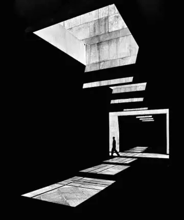
Intrigue
Serge Najjar
|
|
|
Serge Najjar is a Lebanese, self-taught photographer.
Najjar's photography is, most obviously, marked by shapes. This graphic approach was influenced by the Russian Avant-garde movement, of which Najjar references more specifically Alexander Rodchenko. Najjar's understanding of the construction of an image is clear in his work which is spliced into definite edges by a kind of striking geometry.
One of Najjar's aims is to represent the passing of time through painting constructions as temporary places transformed by human activity. This can be seen in lots of his images in which a sole figure breaks up the pure geometry of the photo, making the images into dialogues between the photographer (always the onlooker) and the figure in the space.
The photographer plays with the elements - sun and shadows - to use the mass of negative space which characterises much of his photographs. This sparse approach to composition reflects his artistic philosophy that 'It's not about what you see, but how you see it.'
His work certainly evokes a feeling of 'intrigue', enhanced by the use of negative space as well as his pared-back compositions, leaving the viewer with questions to contemplate.
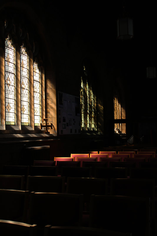
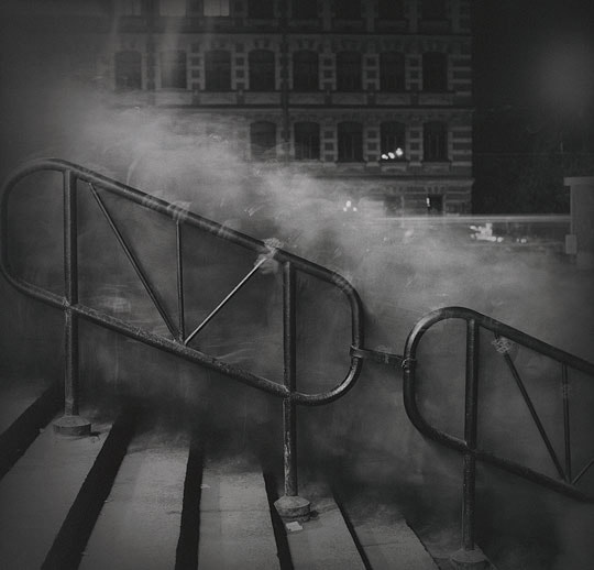
My first thought for taking photos with the inspiration of 'intrigue' was to create an unsure atmosphere using lighting. One of the places that came to mind where I could achieve this was churches. Stained glass and unusually shaped windows would create lighting patterns unique to that environment.
Edits


|

|

I think these photos turned out really well in terms of capturing the atmosphere of the church with light filtered through the stained glass falling on details of the interior, leaving large sections of the photograph in darkness.
I found it interesting to use the theme of intrigue to explore how churches' structures often enhance the mystery of lighting, which I emphasised and exaggerated using a low ISO and high contrast.
I also liked that there was no human presence to disrupt the peaceful, contemplative atmosphere of the spaces.
I preferred the photographs where I captured the effects of the light (top two edits), rather than looking specifically at the light source, as this was more obvious and less intriguing.
However, I liked that my photos were less perfectly polished than Najjar's - I think this told more of the lingering human impact and atmosphere of the buildings.
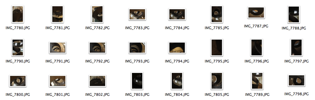
First Development - Intruige
To develop on this idea of the intriguing structure of architecture, I visited the Wellcome Collection. The winding staircase provided an interesting centre point to photograph. I found the shape intriguing as it gives an idea of modernity, appears maybe even futuristic, and almost imposing when looked at from ground level.
Edits


I think that these photos were effective in composition - I think I complemented the shapes of the staircase well with my use of angles and perspective.
However, there was a lack of atmosphere. In the previous church images, I found that the most 'intriguing' aspect was almost what I hinted at but omitted from the photographs. These images were more obvious, which I felt made them lack that aspect of mystery. Perhaps this was due to the harsh artificial lighting.
I also found that only having one structure to photograph limited me.
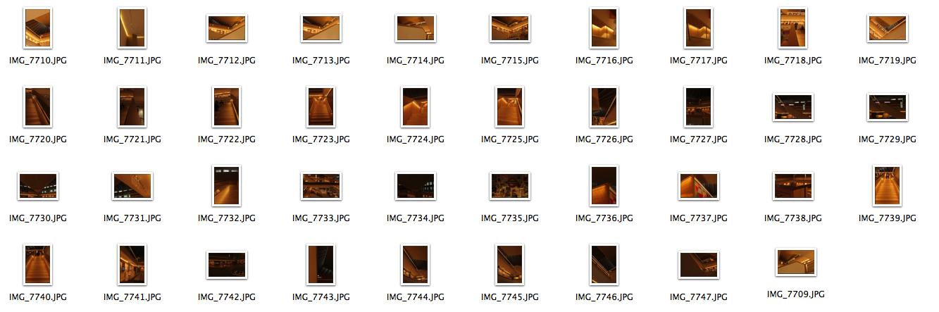
Second Development
I then decided to visit the Design Museum as it's interior architecture makes it unique, and I thought I would find more of a variety of things to photograph, rather than just one structure as in the case of the staircase.
Edits

Example 1
|

|

|

|
I found that the photos that were most successful were the darker ones. I tried to edit all of the images to have a higher contrast of lighting, and to decrease the overall brightness as I believe this gave more of that ambiance I was looking for.
I liked Example 1 the most. The imagery of the stairway itself is 'intriguing' - inviting the viewer onto a physical journey but also to wonder where the stairs lead. The lighting here was also effective, especially after editing to deepen the darkest tones in the image.
I liked Example 1 the most. The imagery of the stairway itself is 'intriguing' - inviting the viewer onto a physical journey but also to wonder where the stairs lead. The lighting here was also effective, especially after editing to deepen the darkest tones in the image.
Third Development
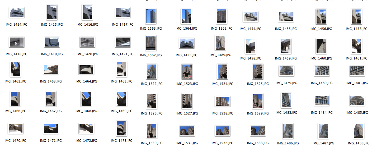
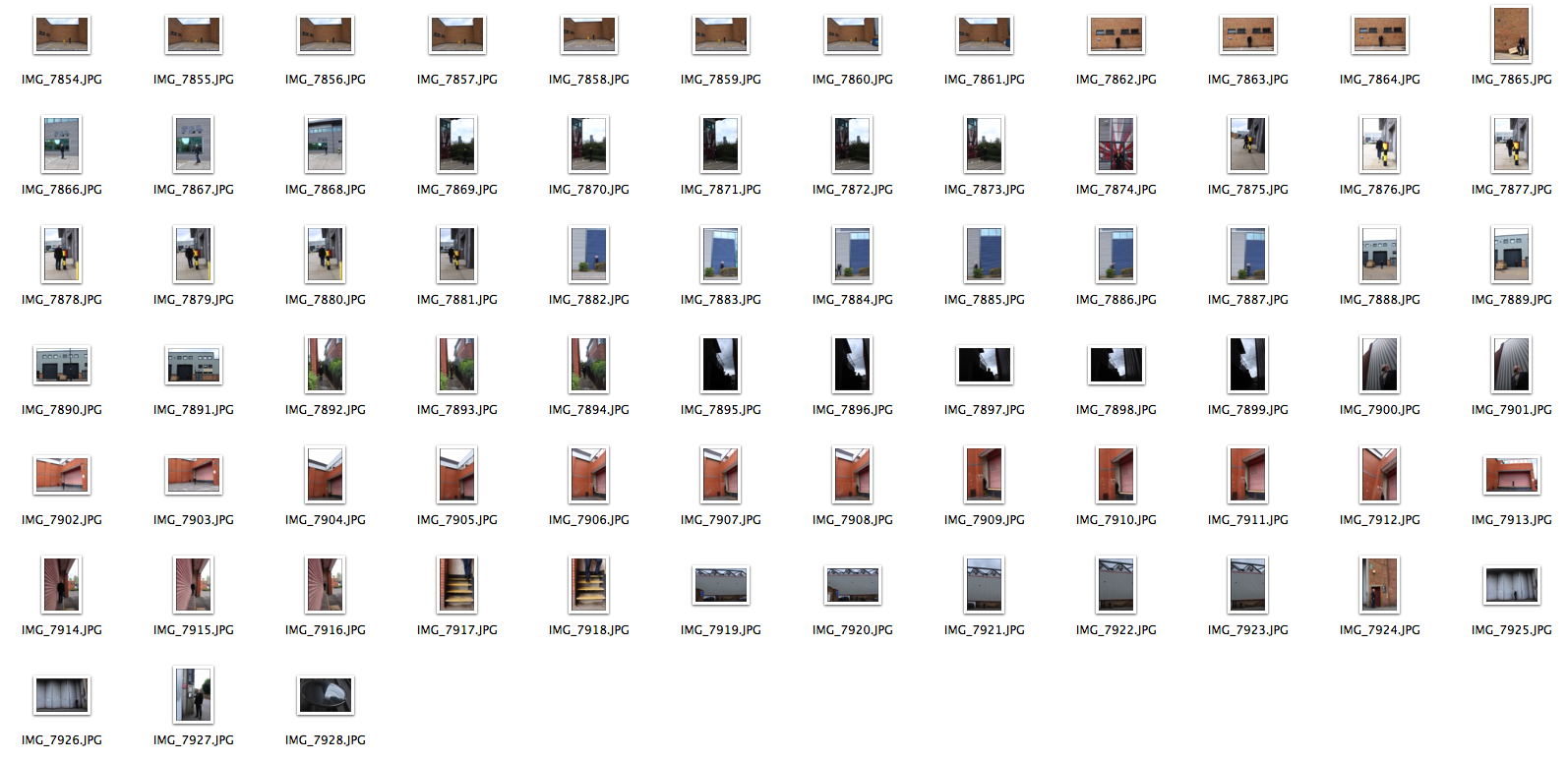
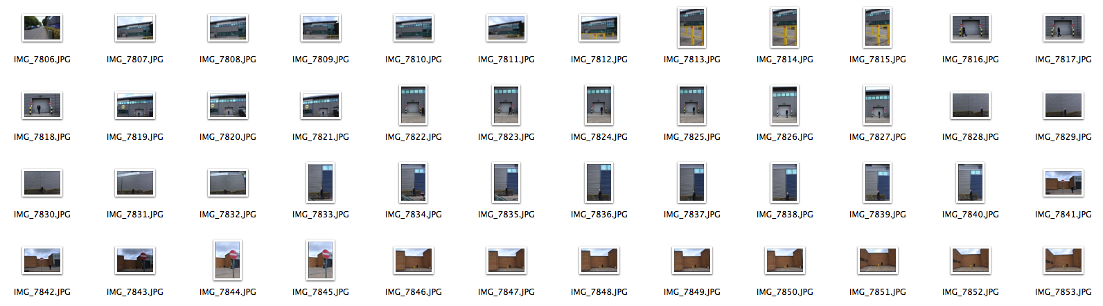
To look further into the idea of intriguing architecture, I looked at Brutalism and the ways in which Brutalist buildings have been presented through photography. Brutalist architecture emerged in post-war Britain (1950s) as part of the modernist movement, when lots of buildings needed to be quickly constructed. The movement was widespread in the most ruined areas as a result of bombing. This caused the emergence of a strand of architecture with an emphasis on materials, textures and constructions. Brutalism is characterised by unfinished surfaces (concrete), straight lines and geometric forms. It is derived from 'Breton Brut', meaning raw concrete. Many Brutalist buildings were also demolished as they were seen as inhumane, visually unwelcoming and even menacing. However, there has been a resurgence in appreciation for the movement - overall, it divides opinions - some see it as stemming from a cruel disregard for comfort, while others see it as fascinating and radical, encompassing a modernist and humanitarian movement for the advancement of efficient domestic spaces.
Simon Phipps
"There can be something thrilling about the aggressive and brash vocabulary of board-marked concrete, exposed aggregate, hard-edged brick and heavy sectioned timber, the expressed palette which displays the truth of its materials and a disdain for the frivolous."
Phipps aims to bring a new perspective to these structures deemed concrete monstrosities, of which the label 'brutalist' is used as an umbrella term to erase the individual identities of each structure. Phipps traverses the London boroughs documenting buildings such as Trellick Tower in West London, the Brunswick Centre in Central London and the Barbican in East London.
Phipps aims to bring a new perspective to these structures deemed concrete monstrosities, of which the label 'brutalist' is used as an umbrella term to erase the individual identities of each structure. Phipps traverses the London boroughs documenting buildings such as Trellick Tower in West London, the Brunswick Centre in Central London and the Barbican in East London.
|
|
|
Centre Point

|

|

|

|
National Theatre

|

|


|

|
St Giles

|

|

I think the photos that were the most successful were the ones in which I created a higher contrast, so when the sun was out and when I used editing to enhance the natural light. I liked the perspective from below as it resembles the feeling and look of these tall buildings looming over in an imposing manner. I also liked the more abstract images where I focused in on details. However, I found that these photos were too literal to be intriguing. Therefore, I looked for ways to experiment with the form of the images.
Fourth Development
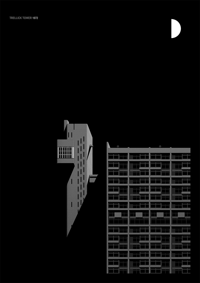
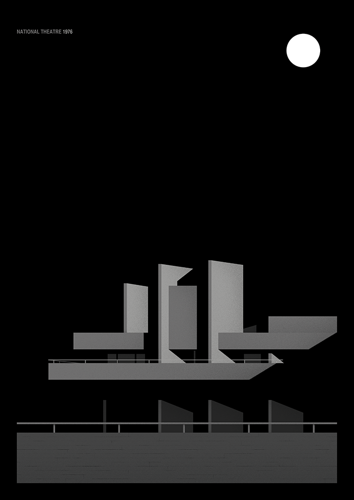
Thomas Danthony - Brutalism
The Brutalism project is a collaboration with Black Dragon press, depicting examples of Brutalist architecture in London.
Thomas Danthony is a French artist established in London. He works predominantly in Photoshop to strip complex images down to their basic essence, taking advantage of stark contrasts in light and dark. This series of screen prints/pamphlets show notable Brutalist structures of the National Theatre, Trellick Tower and the Royal College of Physicians.
Thomas Danthony is a French artist established in London. He works predominantly in Photoshop to strip complex images down to their basic essence, taking advantage of stark contrasts in light and dark. This series of screen prints/pamphlets show notable Brutalist structures of the National Theatre, Trellick Tower and the Royal College of Physicians.
|
|
|
Editing Process
For this development, I flattened the images which I had taken before in Photoshop.
Edits


When editing these, I decided to include the different tones within the black and white as if they were part of the building's geometric structure. I think this made the resulting images more dynamic and interesting while simulating the look that they are three-dimensional. I think the edits look sombre and imposing without crossing the line into dull, which I think was a risk due to the lack of a colour palette and the repetitive shapes. I especially like the first edit as it looks like a graphic design with the perfectly symmetrical structure lining up with the sun's rays, almost completely estranged from the original photograph. However, these photos were more flat and graphic, and I wanted to return to more similar images to those I took earlier on in the project.
Fifth Development
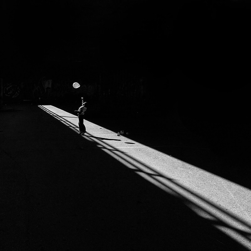
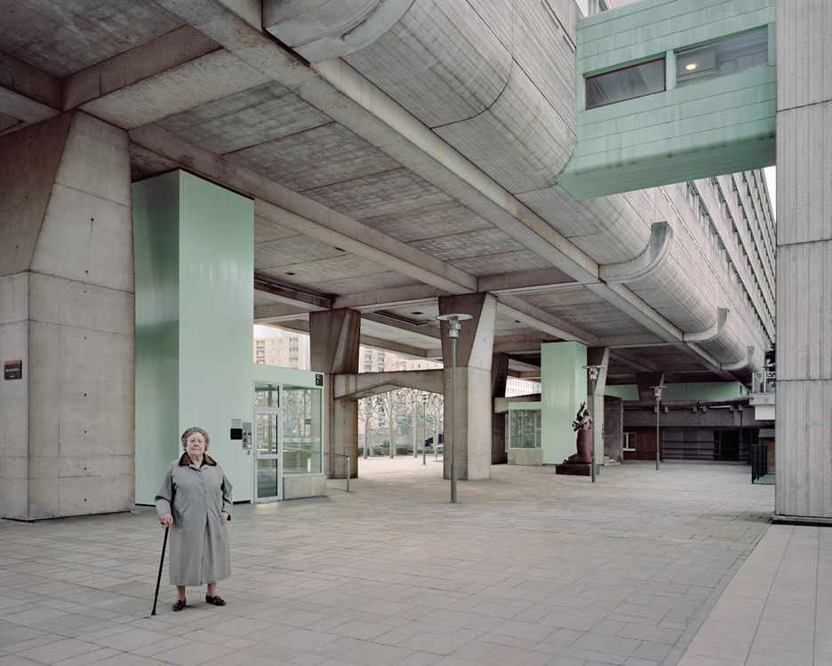
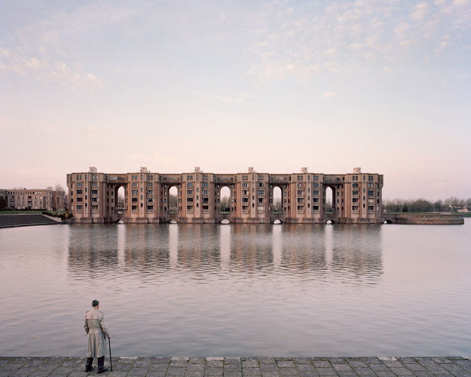
Something I had removed from many of my images of architecture was any human presence. I decided that I liked the photos in which people were standing, unaware of my presence. I thought that having an individual person alone in an environment would be visually intriguing - who are they and what relation to they have to the camera, are they aware they're being recorded? Where are they going and why are they here? This led me to Kronental who places individuals in front of brutalist architecture.
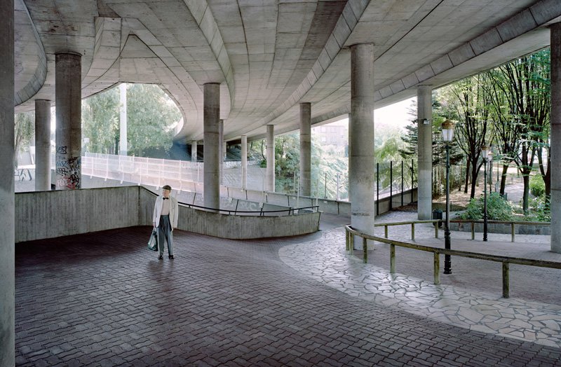
Laurent Kronental
|
|
|
Laruent Kronental is a self-taught photographer based in Paris who is interested in architectural variety and the way in which people tame and inhabit their spaces.
His series 'Souvenir d'un Futur' (2011-2015) captures scenes of the elderly living in large estates across Paris. The use of a large format juxtaposes the vast buildings with the smaller individuals, highlighting Kronental's intention to shed light on a group of inhabitants which are often overlooked. The futuristic complexes, mainly built during the 1970s and 1980s, contrasting to the elderly subjects highlights the fact that this city can be seen an interesting mixture between a modern megalopolis and a place of tradition. Kronental states that he 'wanted to undertake a project that associates men and architecture', shown in his images in his interest in lifestyles and how two eras interact.
Krontental found that these two aspects that he chooses to put together in his images (the elderly and housing estates) are both subjects marginalised in the media. Kronental therefore provides us with an opposing idea than the cliches often spread, choosing to photograph the harmonious balance of modernist architecture and lifestyles from another time.
His use of scale combines the more intimate, emotional portrait with the vast alienation of a landscape. This mimics a kind of interaction between the person and their city.
|
|
Edits

|

|

|

|
I liked that the images created that sense of mystery about the lone figure that I was looking for. I think I achieved this through the use of lighting, the sun created strong shadows which I augmented in Photoshop to make them more dramatic. I also think the images that fit my intentions the closest were the ones in which the figure is farther away from the camera.
On the other hand, shooting in public in a busy area meant that I could not avoid capturing other people in the images and I found that this detracted massively from the figure as the central focal point and made the photos less 'intriguing'. I also think, although the brightness created contrast, this also had a part to play in the photos being less mysterious.
To develop, I think I need to focus on erasing all unnecessary human presence from the frame.
Sixth Development
I then went to a largely abandoned retail park to get this lifeless look I wanted in order to focus all attention on the figure.
Edits

|

|


These photos were successful in achieving my aim of erasing any human presence. Not only did this make the figure stand out more strongly, but it also created an alienated look which was supplemented by my choice of location - the faded greys, stark brick and undecorated metals added to the sense of not so much loneliness but complete abandonment.
I also like that the big spaces meant I could experiment with a surreal element. The figure seems to be in abnormal situations, emphasised again by the lack of human indicators making it seem as if I have captured a moment outside of the ordinary bounds of society. However, I think this strangeness could be enhanced by the use of artificial lighting. I preferred the gloomy dullness of the skies and lighting in these photos compared to the bright ones in the South Bank, however, the photos feel more curious than foreboding and intriguing and I think artificial lighting could achieve this more accurately.
I also would like to experiment further with creating a narrative, rather than just an interesting moment contained to one shot and one place. I think my placing of the figure in terms of composition was successful, however, possibly I can suggest more of a background story.
From my experiments with photographing architecture and structures, I realised that what I was beginning to become more interested in was the relationship between individuals and their spaces. I decided to change my project name to 'Spatial Identity' so I could more closely pinpoint what it is that I was using the camera to explore.
Spatial Identity
Seventh Development
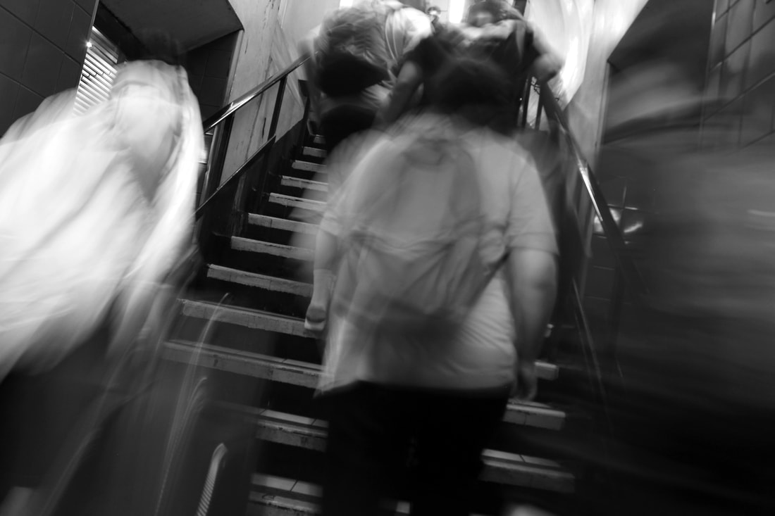
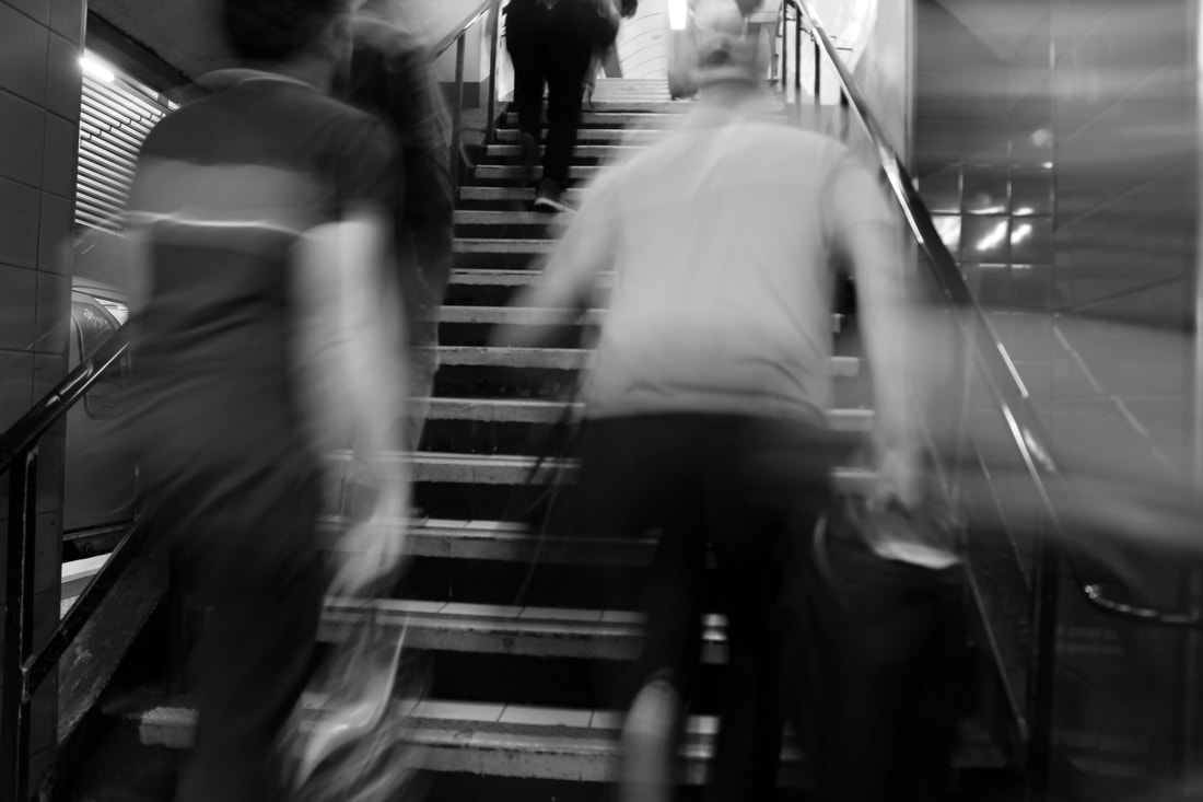
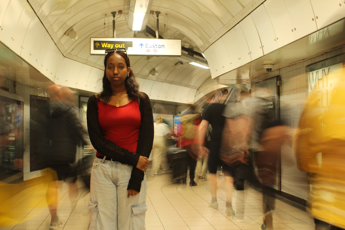
My search for ways in which the camera can capture individuals within a structure of landscape led me to look at the urban photographer Alexey Titarenko who experiments with camera techniques, building on my focus on urban structures.
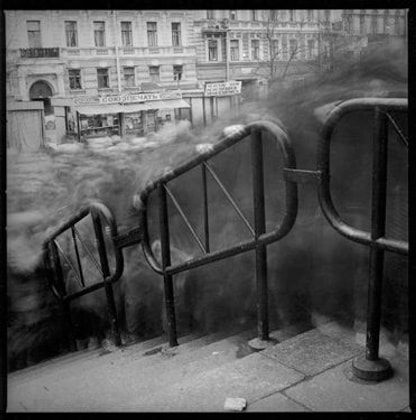
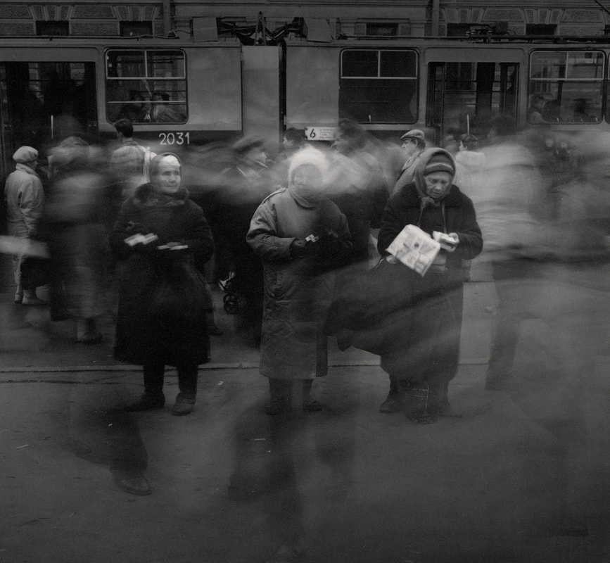
Alexey Titarenko
Alexey Titarenko's series 'City of Shadows' depicts swarming masses of people - blurred to create an ominous and other-wordly look. He calls these his 'people-shadows', which he shot by setting up his camera near the entrance to a subway station leading onto a busy shopping district. Titarenko reveals a more alien side to the everyday, with the sea of people becoming its own amorphous body. He describes the people as 'shadows from the underworld', captured in a still moment by the camera lens.
The sombre tones and gloomy atmosphere not only add to the 'underworld' look but also convey a larger narrative. Titarenko was struck by the lack of vibrancy in his city, St Petersburg. He began to see the people as drone-like and driven to insanity, with their motions only part of a daily routine to sustain themselves, rather than to live. This is reflected in his work through the timing of the images, preferring to photograph during the short, cold winter days for which the city is known for in order to capture this particular lighting.
I decided to photograph using Titarenko's technique as another way to capture the city - its business and the ability of the camera to reveal another side to it, linking also into the eeriness of the city photographs paired with human presence.
|
|
|
Edits
|
|
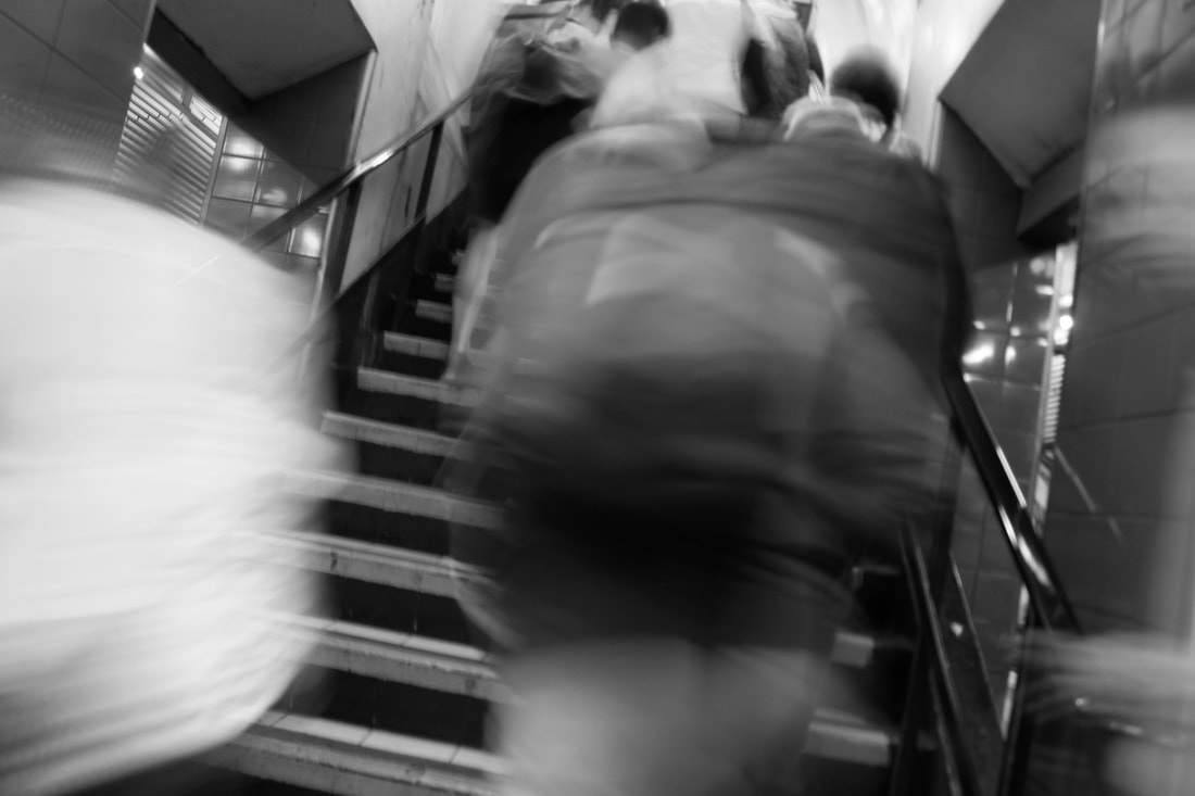
|
|
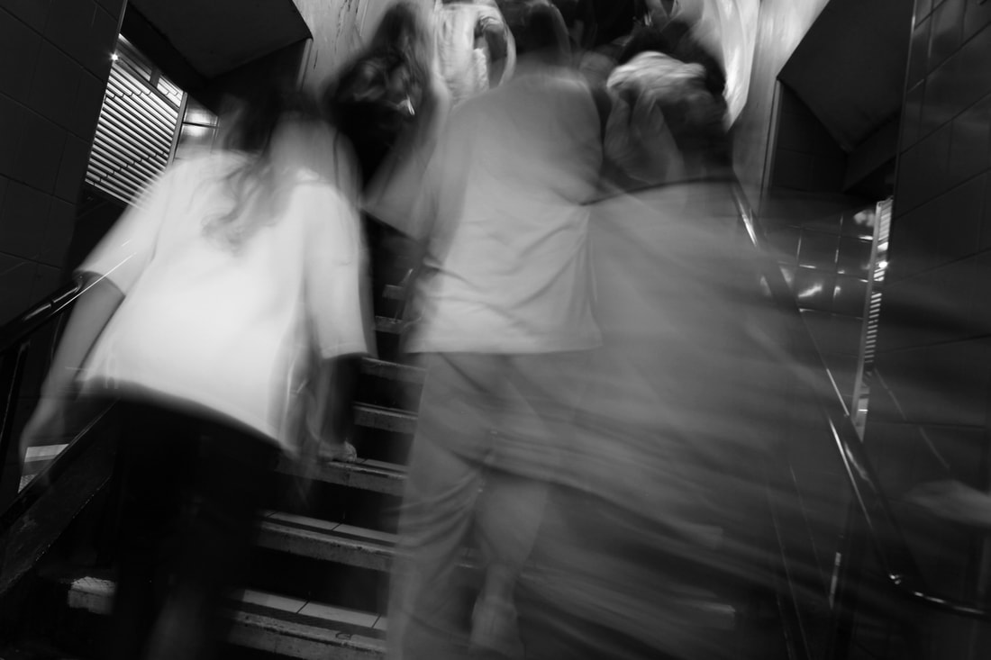
I really liked how these turned out - especially after editing to increase the contrast and decrease the brightness on some. Managing the brightness and slow shutter speed was sometimes difficult but by keeping my ISO on 100 it worked well. I think it was a good decision to take photos indoors as the harsh artificial lighting adds to the otherworldly atmosphere. I think my choice of location was also successful as the static rigidness of the stairs contrasted with the ephemeral flow of activity. I especially like how in the bottom two photos the 'shadows' of people have become nothing more than streaks of light as I preferred when the physical bodies of people were less visible. I think this made the photos more strange and reflected my intention of reducing people down to their motion most accurately.
On the other hand, I liked the elusive flashes of colour that emerged from the blurred people as well as the bright yellow of the stairs, it added some dynamism to the photo. To improve I could keep this in the image.
On the other hand, I liked the elusive flashes of colour that emerged from the blurred people as well as the bright yellow of the stairs, it added some dynamism to the photo. To improve I could keep this in the image.
Eight Development
For my next development, I wanted to include colour. I thought this could also tie back into the more positive, bustling energy of the street photographers I've studied. However, to keep this idea of the more alienating impact of modern living I experimented with placing one individual in front of the crowd. Initially, I went to King's Cross to take photos.
Edits
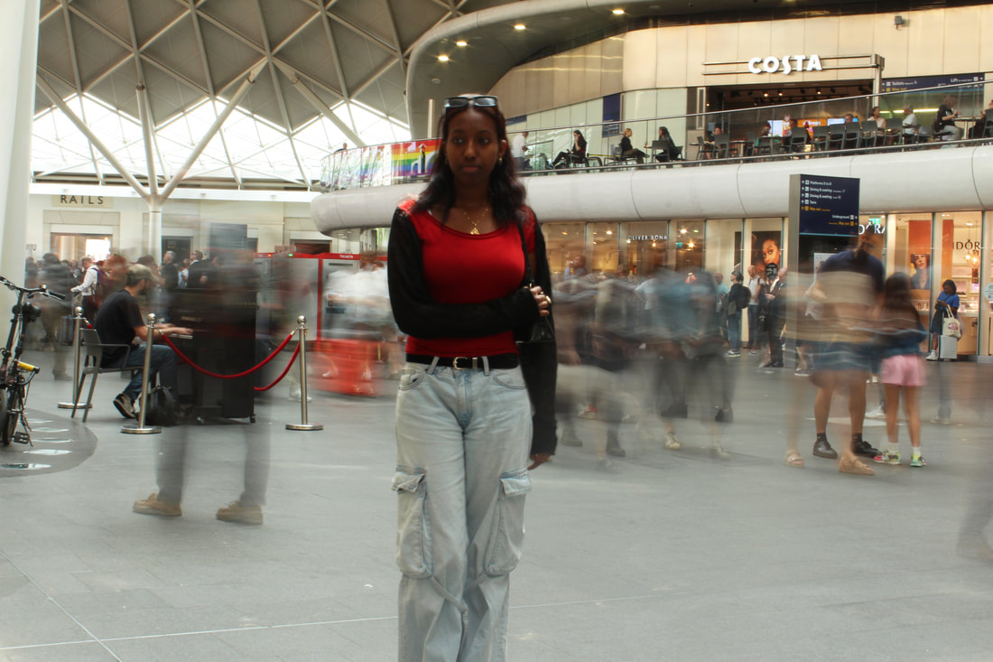
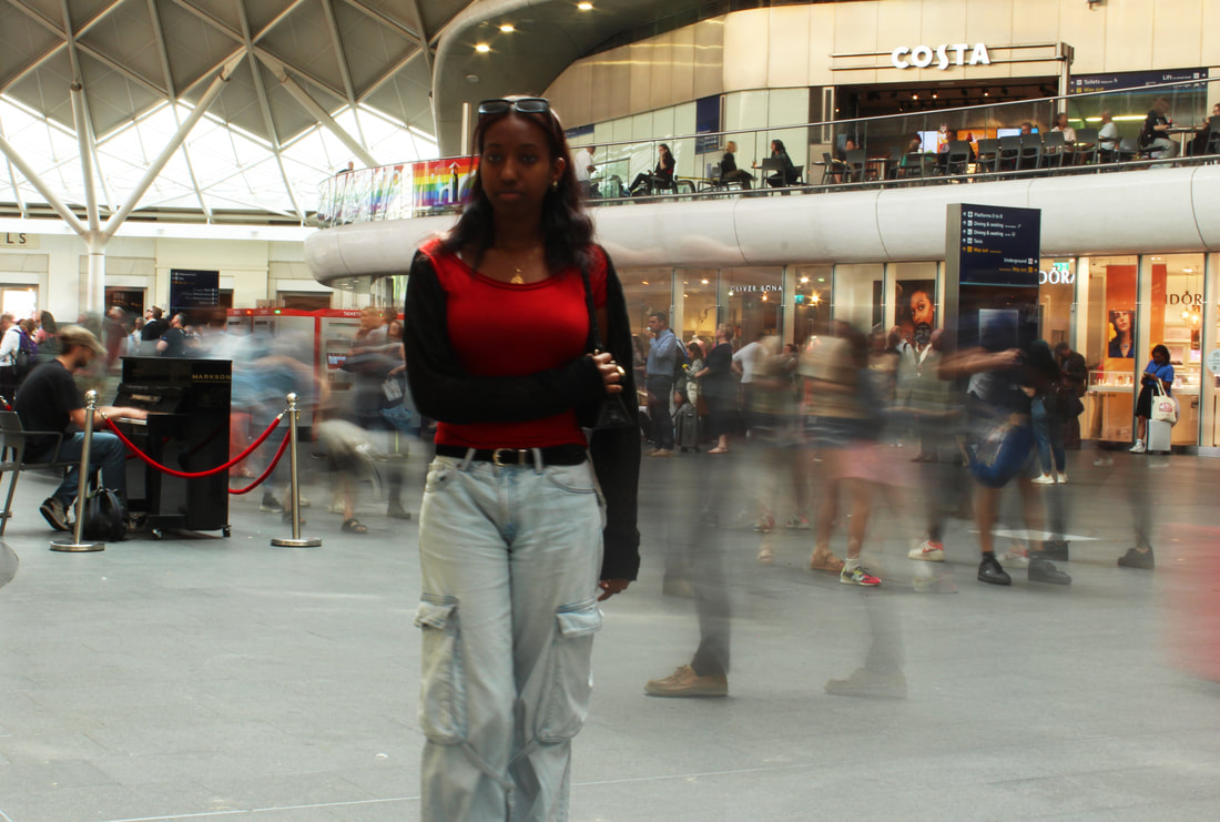
I think these were a good start but the natural lighting made managing the slow shutter speed without the photos turning out too bright difficult. Therefore, I went to another tube station which was indoors with artifical lighting.
Edits
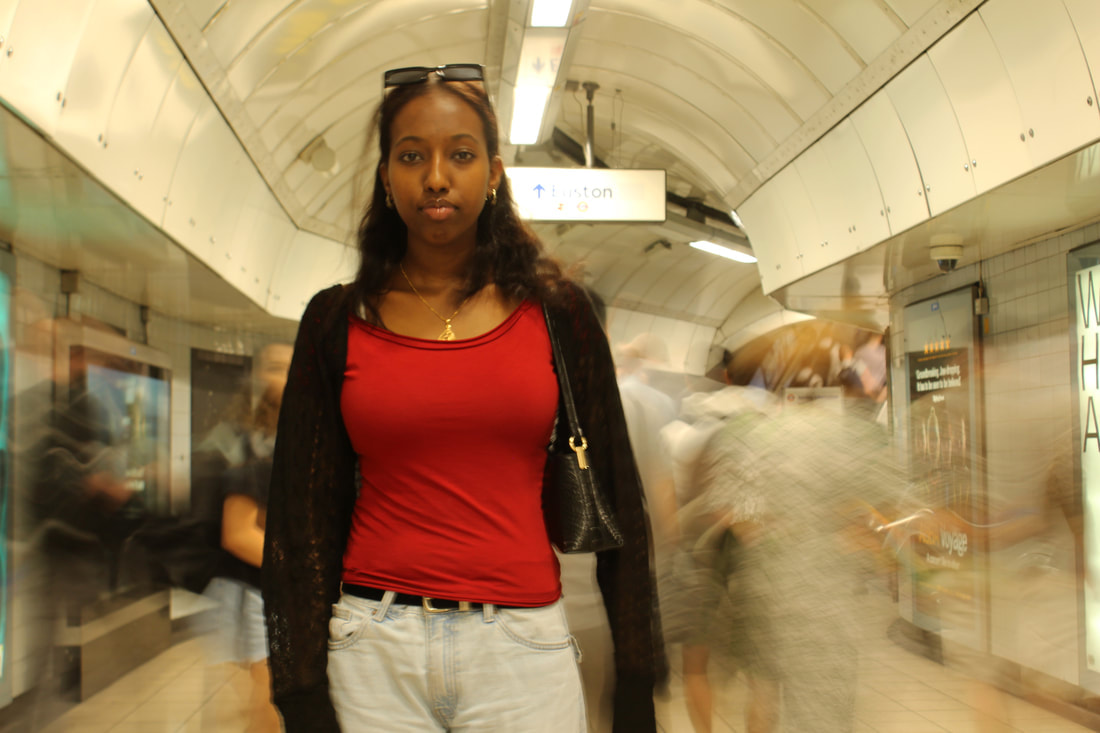
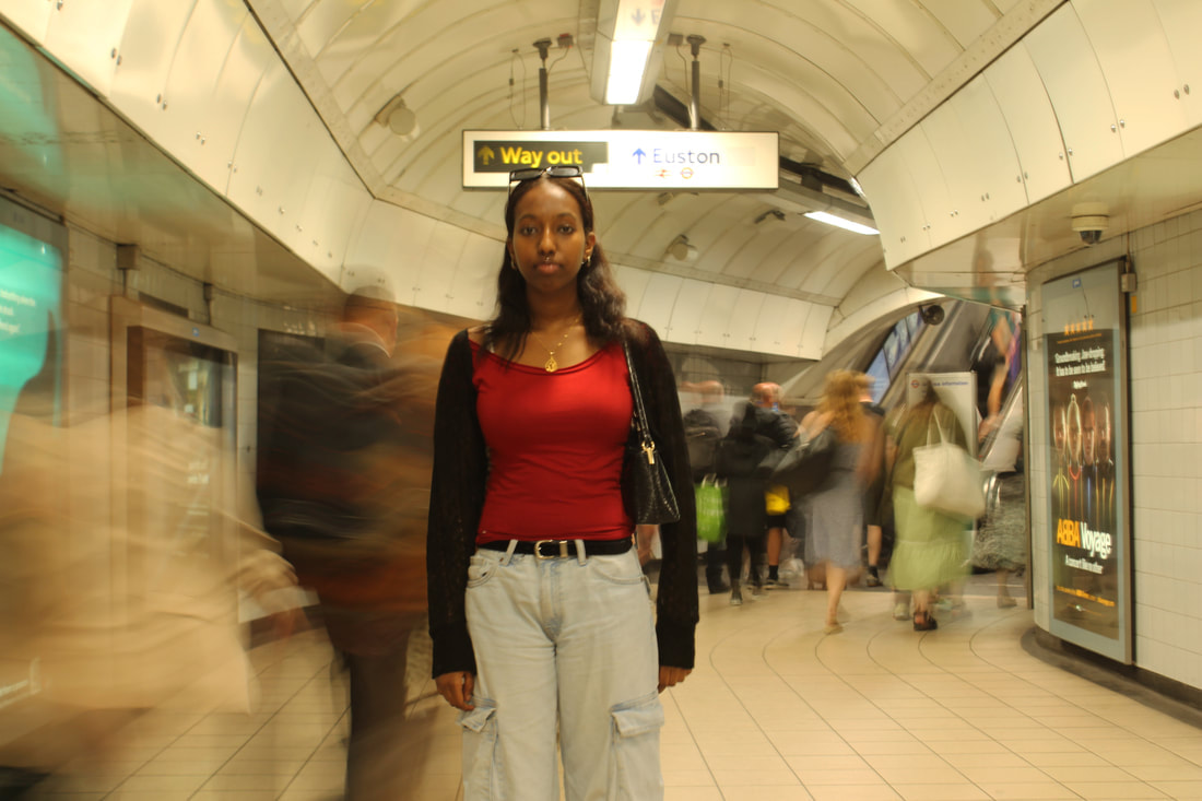
I think these were really successful, however it was sometimes difficult to get as sharp a focus on my model as I would have liked due to the slow shutter speed.
I liked the contrast of techniques with the blurred crowd and the static model and this did reflect my intentions to bring together the energy of the city as well as the struggle of the individual. My subject offers a moment of stillness and serenity amidst the chaos, something that only the camera can freeze and capture. To develop, I wanted to look more closely at the individual themselves within the space.
I liked the contrast of techniques with the blurred crowd and the static model and this did reflect my intentions to bring together the energy of the city as well as the struggle of the individual. My subject offers a moment of stillness and serenity amidst the chaos, something that only the camera can freeze and capture. To develop, I wanted to look more closely at the individual themselves within the space.
Ninth Development
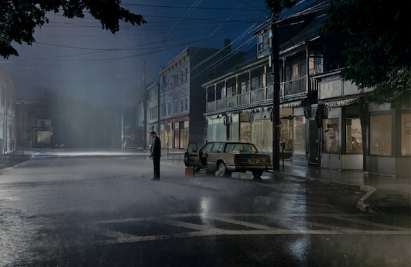
Gregory Crewdson
|
|
|
|
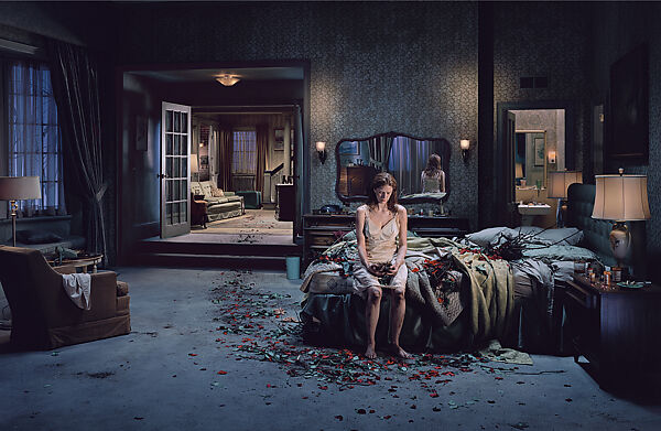
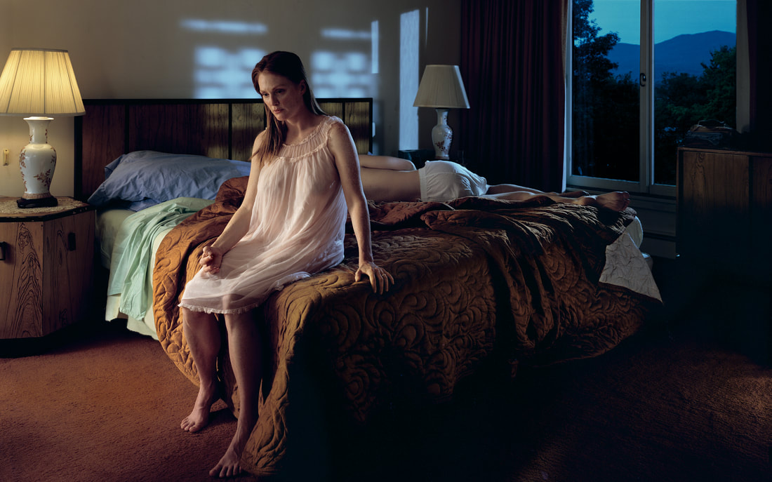
Gregory Crewdson is an American known mostly for his mysterious photos of 'small town' American households and neighbourhoods.
Crewdson is interested in the silent psychological inter-zone between the everyday and the uncanny. Although his photos in theory should seem mundane - recognisable places to most Americans, with unassuming figures - Crewdson's meticulous attention to detail makes them into something more. He typically plans each image in terms of orchestrating lighting, colour and production design in order to create unreal, dream-like spaces outside of our sphere of reality.
There is also an element of mystery and suspense in his images. To me, they often look like the aftermath of a curious event which has taken place - for example, the girl sitting on the bed looks mournful for a moment which has already passed. He does this by creating theatrical sets and situations, interweaving ideas of memory and the imagination with narratives of pain and redemption which run through America's story.
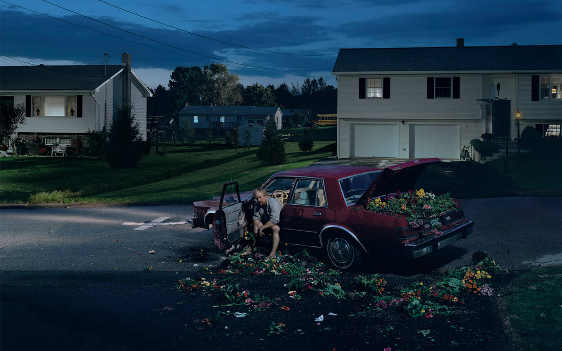
I wanted to use inspiration from Crewdson's photography to set up my own orchestrated scenes which combine Crewdson's psychological realism and magical aesthetic sensibility.
Edits

|

|

|

|
I particularly liked the use of lighting in these images. The contrast created by the artificial lighting was effective. I think the images worked well as a kind of mini, self-contained series with the subject in different places, each time seeming contemplative and slightly out of place. However, sometimes I found it difficult to get the most out of each location as I moved quickly from one to the next.
I liked that the places in the images were recognisable, as in Crewdson's work, but turned into something more mysterious by the lighting and the model's expression - the simplicity of the locations like the doorway and the bus stop I think worked well. The feeling of potential evoked by this mixture between the mundane and the slightly uncanny reflects how Crewdson's work creates dream-like spaces just outside of the sphere of reality.
I liked that the places in the images were recognisable, as in Crewdson's work, but turned into something more mysterious by the lighting and the model's expression - the simplicity of the locations like the doorway and the bus stop I think worked well. The feeling of potential evoked by this mixture between the mundane and the slightly uncanny reflects how Crewdson's work creates dream-like spaces just outside of the sphere of reality.
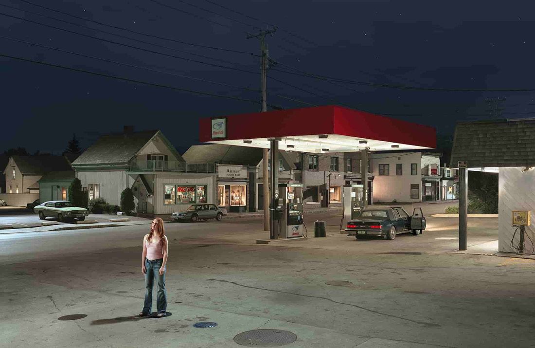
Tenth Development
I then decided to use just one location so that I could focus more on capturing different angles and compositions. I visited the petrol station with my model once during dusk, during which the lighting was brighter and softer, and then again further on into the night, during which the artificial lighting took over.
Edits

|

|

|

|
I liked that the dusk lighting seemed to bring out the colours of the petrol stations lights as well as the sky, almost making the colours seem candy-like and artificial, which I think was successful. However, the night-time lighting was more dramatic and highlighted the uncanniness of the situation in a more exaggerated way. It seemed more strange and out-of-place for my model to be standing in these places in the night, at times making her look like a vulnerable figure.
I think the use of only one location worked well as I could create more of a still from a narrative as in Crewdson's work. To develop, I want to create more of a story, perhaps through the use of props, or more closely staged situations. Perhaps I could also choose what my model wears to create more of a presence.
I think the use of only one location worked well as I could create more of a still from a narrative as in Crewdson's work. To develop, I want to create more of a story, perhaps through the use of props, or more closely staged situations. Perhaps I could also choose what my model wears to create more of a presence.
Eleventh Development
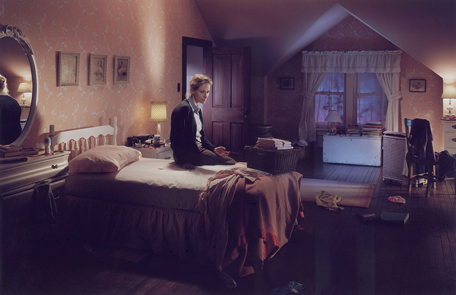
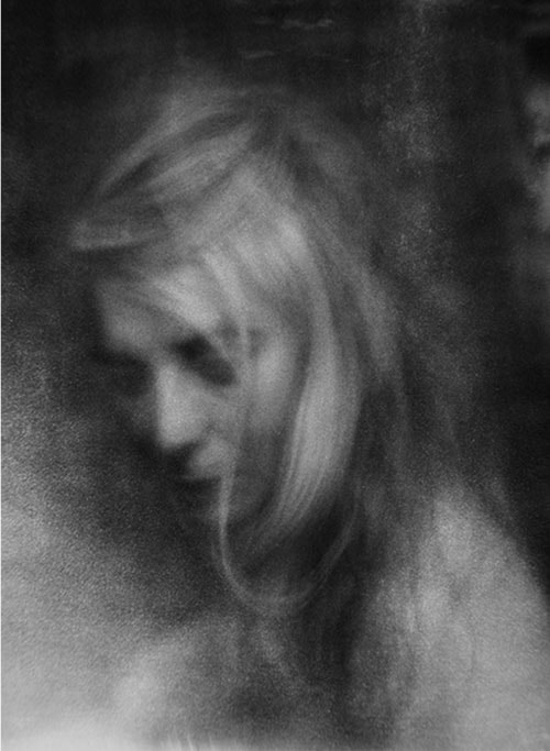
I then decided to take similar photos indoors as I thought I could create more of a palpable scene if I had more control over the specific set-up of the room and the model. I looked in particular at Crewdson's photos in bedrooms, with people sitting on beds. To create more of a manufactured scene like a still from a film, I tried to take more control by dressing the model and getting different set-ups with different lighting (the more bluish light is natural while for the darker light I drew the curtains and used lamps).
|
|
Edits


I liked the use of lamps to create a darker and more mysterious look, however I think that the bluish lighting was the most successful as it mirrored the twilight tinge of Crewdson's work, making more of a feeling of a threshold moment, the threshold between day and night, and the threshold between one scene and another.
By choosing the model's clothing, I think I was successful in giving her more of an interesting presence. I chose the dress as it makes her into a more vulnerable figure, creating some kind of tension or suspense within the scene. The choice to use the blazer for some of the shots, then, complicated this idea. The crumpled jacket on her body evokes ideas of precarity and disorder, confusing the ordered nature of the room. I think my choice of setting of a bedroom was also effective as often I felt like an outsider intruding upon the more intimate inside setting, especially in the shot with the camera looking through the crack in the door. I think this achieved some of the reactions of confusion that the view may feel looking at Crewdson's work - what has taken place just before this moment? Why has the camera encroached upon this private scene?
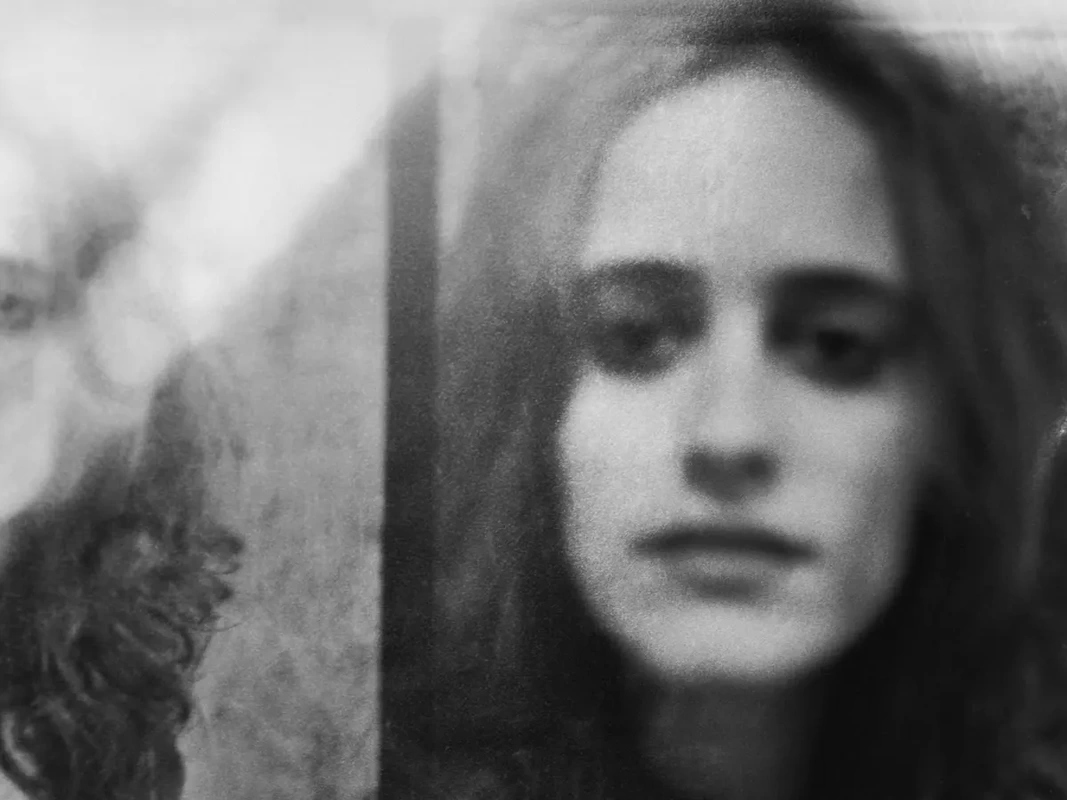
To develop further, I liked the more close-up portraits that I took during this development, such as the one below, but which did not fit as well with my criteria for Crewdson's work. I want to take the idea of the camera as an intruder into personal moments and personal space further, perhaps with some more close-up shots.
By choosing the model's clothing, I think I was successful in giving her more of an interesting presence. I chose the dress as it makes her into a more vulnerable figure, creating some kind of tension or suspense within the scene. The choice to use the blazer for some of the shots, then, complicated this idea. The crumpled jacket on her body evokes ideas of precarity and disorder, confusing the ordered nature of the room. I think my choice of setting of a bedroom was also effective as often I felt like an outsider intruding upon the more intimate inside setting, especially in the shot with the camera looking through the crack in the door. I think this achieved some of the reactions of confusion that the view may feel looking at Crewdson's work - what has taken place just before this moment? Why has the camera encroached upon this private scene?
To develop further, I liked the more close-up portraits that I took during this development, such as the one below, but which did not fit as well with my criteria for Crewdson's work. I want to take the idea of the camera as an intruder into personal moments and personal space further, perhaps with some more close-up shots.

Twelfth Development
Martin Bogren
From series 'August Song'
|
|
From series 'Tractor Boys'
|
Martin Bogren is a Swedish documentary photographer who began his career following Swedish musicians and recording them on stage, on tour and in the studio. From this, Bogren wanted to take his photography further, to a place more personal to him.
His series 'Tractor Boys' (2012) documents the lives of a group of teenage boys who race EPA tractors. What struck me about the images I saw at Paris Photo were how his images capture personal, cherished moments, freezing them in time forever, but also maintaining a sense of movement. This is exemplified in 'Tractor Boys' where Bogren records those quiet times which may go unnoticed, like the boys sleeping in vulnerable positions and the girls watching the races with poignant looks. Simultaneously, he captures the boys in cars speeding past the lens, encapsulating the fast-paced nature of the excitement of adolescence.
Furthermore, his series 'August Song' (2019) documents balls in the Swedish countryside. His focus on intimate details gives us an insight into how humans interact and how the photographer interacts with this. The grainy look of the images reflects a kind of fever of the ball, us as viewers can feel the exhilaration of new love, of dancing in the night and of human energy. Bogren makes all of these photos look as if they were taken on a spontaneous instant, blurred with movement, and soft with feeling, becoming an allegory for the innate human urgency to live, to surrender, as the photographer lives vicariously through their subjects and through their medium.
I wanted to take images which captured these personal moments as Bogren does, in close-up shots of people and their gestures.
Edits

|

|


Example1
To achieve the slightly blurry look that Bogren uses I shot the portraits in low light using only a lamp. Although this did make the photos softer, I found that they looked more grainy than in motion like Bogren's work, however overall I liked the effect this had on the photos, especially after editing to increase the visibility and contrast through lighting levels. To improve, I could use a slower shutter speed and stronger light to focus on capturing movement and creating a sense of energy, which I think these images are lacking.
I think the photos using the plant's shadow were successful in adding another visual element. With the photos unclear, it is also unclear what is intruding on the model's face, which I liked, however I think this was straying from Bogren's work a little. I think that Example1 was the most accurate to Bogren's intentions of capturing a more intimate, off-beat moment as the model seems to be unaware of the camera.
I think that the images using the mirror were interesting. I liked the fact that, through my use of composition, it was unclear what else was in the room - other objects are only hinted at, such as the corner of the mirror, or the slight impression of the model's arms. Although it is interesting that I as the photographer seem to be intruding upon my model's personal space, I found that these photos did not relate heavily back to the idea of identity as linked to a space.
Thirteenth Development
To develop on the work I created in response to Bogren, I wanted to explore self-portraiture and this idea of identity that I had hinted at, but to link this back to space more. This led me to Mario Fonseca who creates partially obscured self-portraits whose creation was motivated by the political situation he was living under.
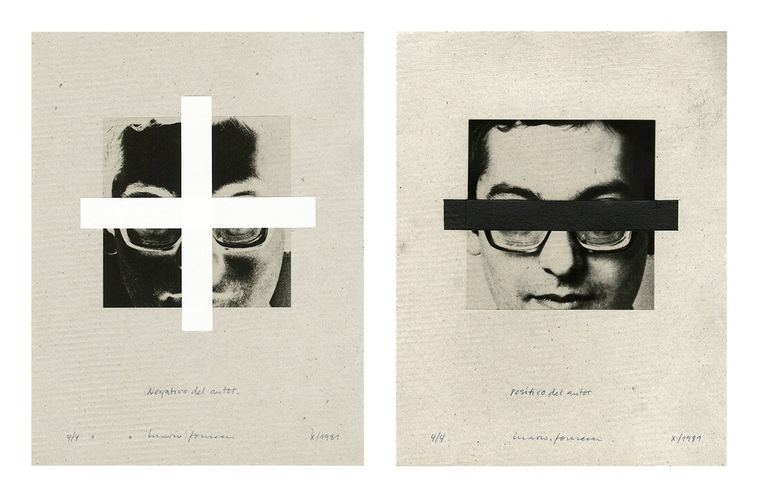
Mario Fonseca
Mario Fonseca is a visual artist, art critic, curator, academic, writer, designer and Chilean publisher. Born in Lima, Peru, in 1948, he has lived in Chile since the 1960s. His work explores the suffering of the individual under the oppressive military regime in Chile from 1972 until the early 1990s. During this period, repression led to people finding safety in hiding and anonymity as the regime would punish any dissidents. Especially for artists such as Fonseca, this environment was unbearably restrictive.
Fonseca's self-portraits were born out of a necessity to stay inside with no one to photograph but himself. His ability to experiment with such limited means is shown in the fact that he uses and re-purposes the same self-portrait over and over in this series of works from 1979-1983. This gives the viewer the uncanny idea of being trapped within the same photo, reflecting the constriction felt by Fonseca and others during this time in Chile. Furthermore, his self-portraits highlight his individuality, however they are complicated by materials such as shattered glass within the picture frame. This emphasises the struggle to be individual under a regime which forces homogeneity.
Additionally, Fonseca explores the dimensions of identity. In order to partially obscure his identity, he uses mixed media such as a sheet of bubble wrap to soften his likeness or a black line which obscures his eyes. This technique allowed him to create and exhibit art, albeit at his own peril. The fact that Fonseca showed his face was very dangerous, and his insistence on putting himself out in the world in this way is his rebellion against a time of censorship and limitation.
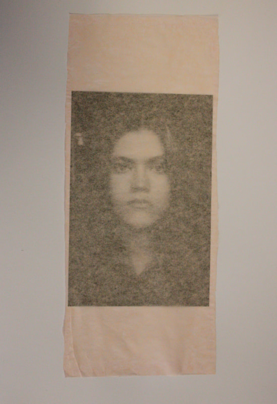
Original Portrait
|
|
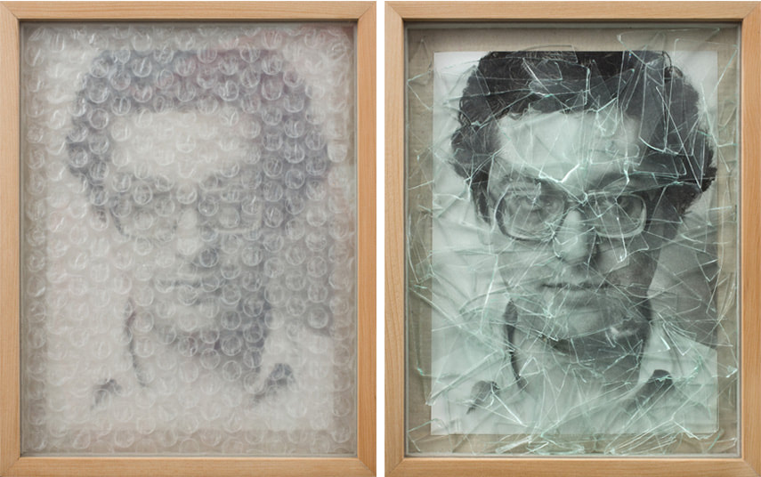
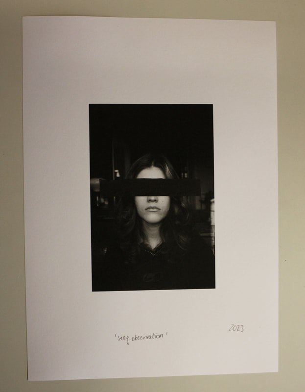
In response to Fonseca's work, I took self-portraits and then edited these into black and white with a slightly increased contrast. I then chose one self-portrait and printed this multiple times to limit the material that I had to work with. I experimented with different forms of material media, namely coloured tissue paper and bubble wrap. I looked closely at Fonseca's work for inspiration and saw that he sometimes wrote down marks of 'X' and the date which he made the work as well as titles such as 'L'oberservation de soi meme' (self-observation), and I considered how I would use these for myself.
|
|
|
For this image, I cut the strip to cover my face to partially obscure my likeness. I also decided to sign the work with the year. I think the timeframe is very important to Fonseca's work as the context within which he was working in pushed him to create the work. Therefore, by signing the work with the year, Fonseca signals that his works are acts of defiance. I wanted to represent this in my work.
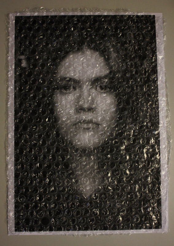
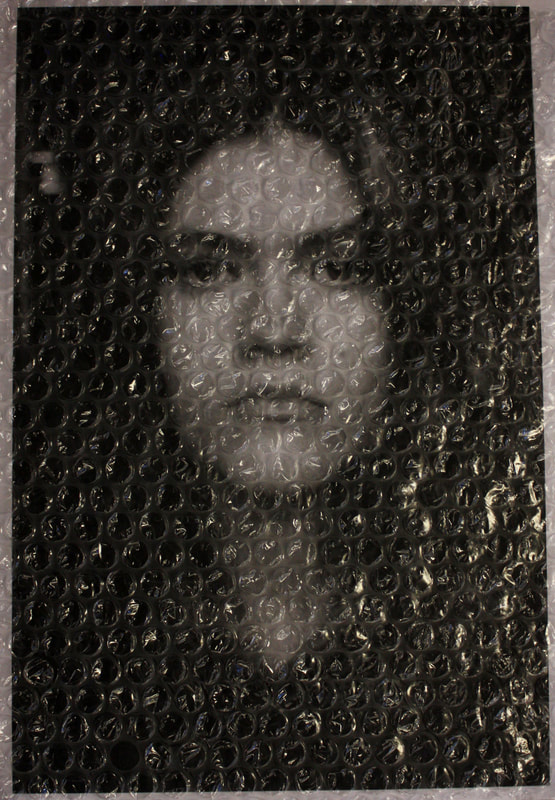
I decided to use the most close-up portrait for the experiments with bubble wrap as I thought the wrap would mute the obviousness and up-front nature of the self-portrait. I only placed the bubble wrap over the print for this collage as I found that gluing the bubble wrap distorted it. The main difficulty I encountered was photographing this collage. The lights reflected off the bubble wrap which reduced the visibility. I also took images in low lighting to try and avoid this issue, however then it was too difficult to see the self-portrait under it.
|
I mimicked Fonseca's black line over the eyes for this collage as I liked how this brought a certain harshness to his collage. I used the print in which the photo is the smallest within the paper as the use of white space brought attention to the black line at the centre of the image. I decided to write 'self-observation' as Fonseca does at the bottom of the page as it seemed suitably ironic to me as my eyes are banned from 'observing'. I also continued my idea of writing the year.
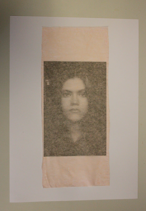
For this collage, I was actually planning on cutting a strip of this pink tissue paper which only obscured my face. However, when the paper fell on the print in this way, I liked the fact that it obscured the whole image while keeping some visibility due to the thinness of the paper.
|
Edits

1
|

2
|
3
|
4
|
1 - I think my idea of writing the date was successful, especially as the lightness of the paper brought attention to it. The paper's lightness also brought attention to my face, and so concealed and showcased my identity at the same time, suiting my idea. Furthermore, I think this is the print in which the background is the most obvious. Although Fonseca's self-portraits feature only his face in a close-up, I do not think that the background in my images detracts from them. It makes it clear that I am inside, reflecting Fonseca's entrapment, and parallels elements of Fonseca's work in which he photographed himself doing everyday things in the home. I think the composition of the collage also works well as the printed photo is quite soft and dim. This contrasts with the harshness of the rectangular shapes created by the tissue paper, forming an interesting visual dynamic.
2 - I think that the use of the black line over my eyes was successful in being harsh as I intended, reflecting the violence of enforced silence/censorship.
3 - Although I had difficulty photographing this work, the image I have used above was the most successful, using muted artificial lighting. I think that the small white margins around the print framed it nicely, tying into the white of my face at the centre of the print. Overall, I found that the bubble wrap had my intended effect. My face was visible through the wrap, without being too obvious. I liked that it muted the details of my self-portrait, leaving an impression of a face rather than anything too clear, paralleling Fonseca's double intentions of exhibiting and hiding.
4 - I liked that dark photo bleeds through the pale pink as it adds an element of contrast which also showcases the texture of the tissue paper, adding a grainy look to my self-portrait which was successful. The tissue paper frames my image, but also spreads outside of it, breaking up the strict boundaries of the photo on the paper, which brought to my mind ideas of artistic freedom.
As a series, I think the collages were successful in achieving my intentions. It is obvious that all of the self-portraits I have used are the same photo but interpreted and manipulated differently, which I think gives the overall ensemble a kind of cohesiveness despite the different collaging techniques I used, reflecting Fonseca's ideas of the ongoing importance of individual expression despite limitations.
However, to develop, I wanted to open out the topic. The works that Fonseca created were very specific to the place and time during which he was working and creating, and I found that this made the photos perhaps less accessible and relatable for the viewer.
Fourteenth Development
I was inspired by Fonseca's use of multimedia to explore more in this direction, which led me onto Katrien du Blauwer who similarly uses collaging to obscure as well as to showcase images, but instead with found photos.
Katrien du Blauwer
Katrien de Blauwer is a Belgian artist with formal training in painting as well as fashion. Her turn to collaging was initially a form of 'therapeutic self investigation' (de Blauwer) and she kept her works from the public for many years before showing them in 2014 for the first time.
She describes herself as a 'photographer without a camera' (de Blauwer) as she collects and reuses photos from old magazines and papers. De Blauwer sees her work as universal as well as personal. Through her use of found photos, she creates her own world of interesting details and severed body parts which emphasises the impossibility of the sole individual as everyone can recognise themselves within this story. However, this response is also personal to each viewer in the same way that each of the images become personal to the artist as she interprets them for herself.
Her work also deals with memory. Lots of the images she uses are from magazines printed in the west between 1920 and 1960. Her re-purposing of these fragments saves the images from destruction and creates a kind of accumulative memory which we, as viewers, may feel we recognise.
A repeated theme in her works is the female body, shown in her interspersion of disembodied limbs and lips. Her work is therefore commenting on the presentation of femininity during the mid-20th century, with her disdain for this demonstrated in her choice to intrude upon the photo using splashes of paint. This is also emphasised in one of her series' titles, 'Attack', paralleling how the artist brutally cuts through pages to achieve her own vision. However, the artist is clearly attracted to the imagery of the women and the fashion, creating a certain tension as she brings admiration and dissatisfaction together in her works.
Du Blauwer's work appealed to me to use as a springboard for my next development as it has this quality of universality and relatability which Fonseca's work does not. Although Du Blauwer is dealing with similar themes of representations of identity, she mixes media from different places, shown for example in the imagery of the doors below. Her work, for me, suggests a broader idea of the relationship between place and identity.
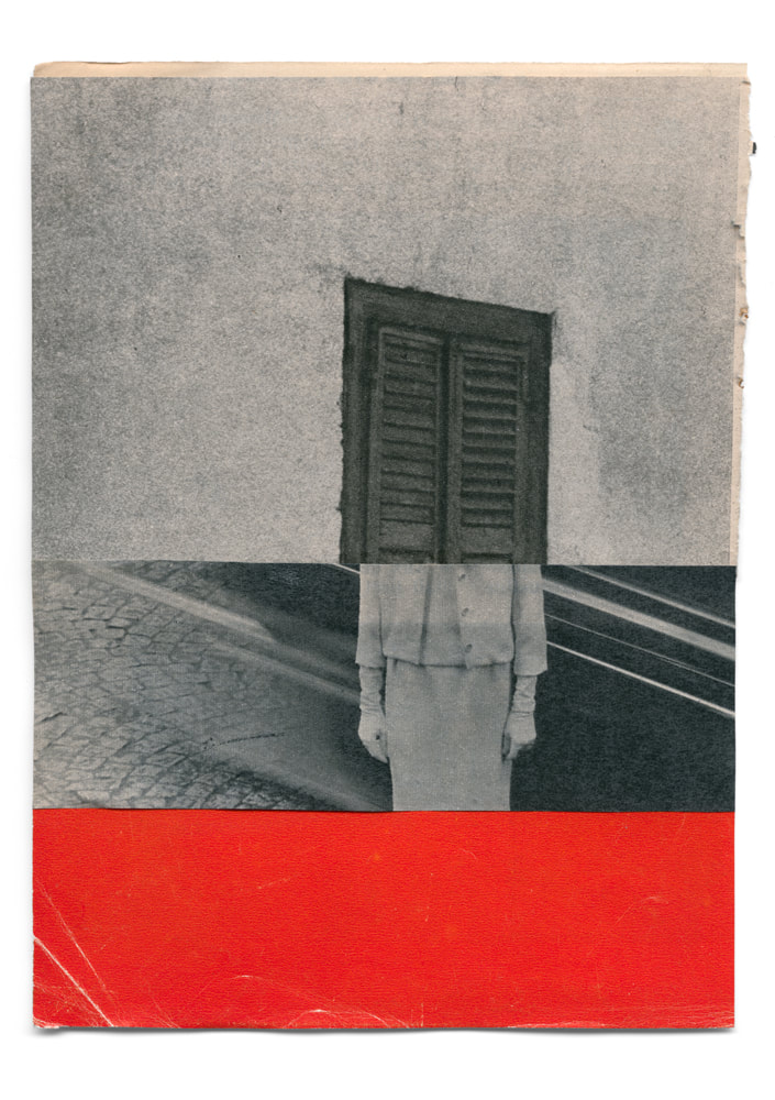
From series 'Attack', shown in 2020
|
|
|
Using elements from photos I had already taken, as well as extra pieces of paper, I tried to create my own collages. I then scanned these.
Example Process
|
|

|
Although I liked the look of the textured brown envelope, this collage is actually an example of one of the failed works I made and decided against presenting. I found that my use of the two images side by side in this way was too literal and comic.
Scanned and Edited

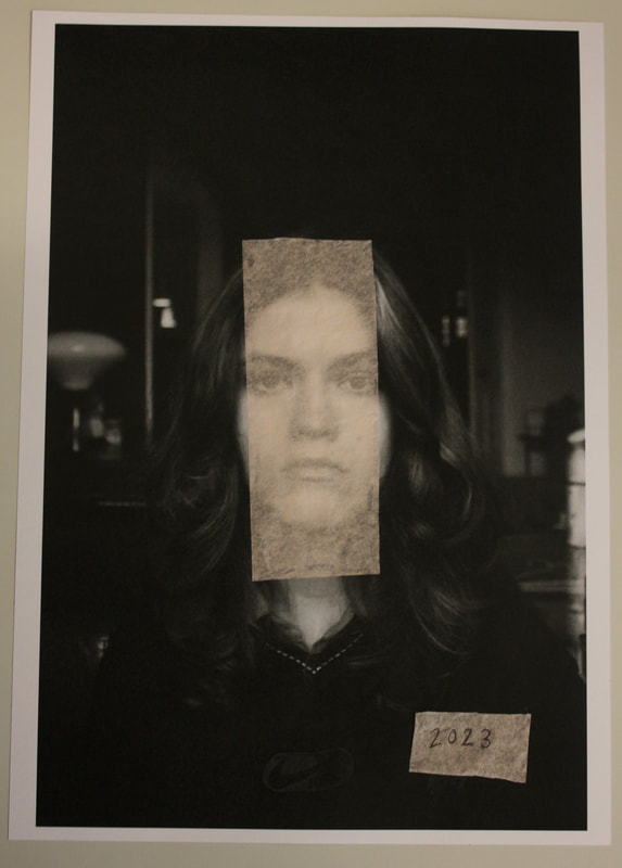
I think the way in which the bottom photo was cut horizontally was effective in brining that element of universality to the work as it cuts of the subject's eyes, giving us the impression that this could be anyone. The tone of the bottom image is cool, giving it a dreamy look which I think compliments the setting of the bedroom. The pillows and bed especially emphasise the personal setting, however the sharp cut off brings up questions as to why I have chosen to disrupt this comfortable space.

|

|
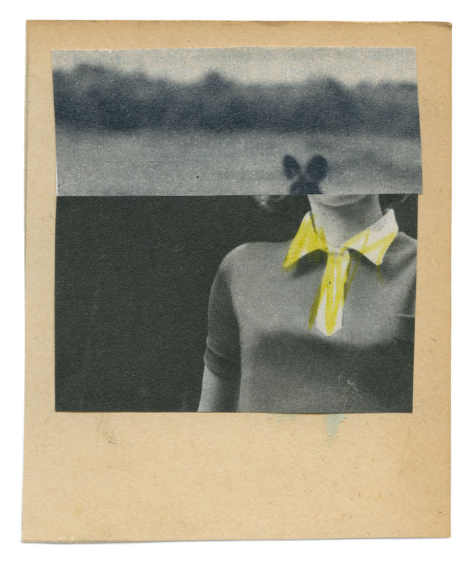
I showed the scan as well as a photo I took from above of the piece to show how the edges of the card look, emphasising the bottom of the card which is slightly scuffed, which I liked. I think this piece in particular was successful as the blue brings out a feeling of contemplative melancholy, bringing out another side to the photographs of the subject. I was particularly inspired by De Blauwer's use of splicing images and re-pasting them side by side, which I think I reflected well.

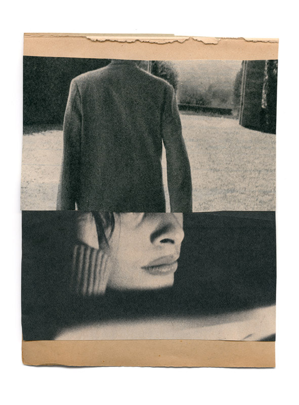
This collage differs from the others as I have shown the subject's face and eyes. However, I found that it was not too obvious as the image is quite mysterious due to the lower lighting. Here, the contrast of the impersonal office blocks with their harsh lines and the homey space is severe, highlighted in the fact that I used a black and white image with two coloured ones. I think this is effective is representing the different environments I have captured throughout this project.

Although this collage features three very different elements, I found that a sense of cohesion was maintained due to the relative formal symmetry of the images, for example, the circle of the lampshade is echoed in that of the sign, as are the straight lines of the bookshelf to the corrugated metal. The use of the strip of brown envelope highlights my power as the collage-maker as it makes it very obvious, reflecting how, as in de Blauwer's work, I have repurposed these images for my own purpose.

I like how the brown envelope frames the collaged images, adding visual dynamism to the image which could be lacking due to my choice to use two black and white images. Both images show still figures in different situations - the severity of the outdoor building juxtaposing the plush softness of the bedroom. I found that this had my intended effect of highlighting the similarities between the two figures despite their contrasting environments. Perhaps having both images in black and white focuses the viewer's eyes onto the figures themselves more closely and encourages them to find the differences and similarities between the two.
After analysing all of these photographers, I have come to the conclusion that they all consider the idea of ‘Spatial Identity’ in different ways, of which I have taken and reworked for my final piece. My initial focus on architectural photography, such as the works of Simon Phipps, influenced my use of images for this piece to collage with, bringing a certain geometric harshness to the softer images of indoors spaces, and making me consider the significance of these structures within human life. Elements of the feelings of isolation and urban alienation which I gathered from studying Titarenko are clear also, with the lone figure being the only human presence, however, the splicing of these individuals together relates back to the universality of De Blauwer’s work, bridging the gap between two separate spaces and shoots. The creation of the sense of a palpable scene is a skill which I developed through looking at Crewdson, which I think successfully impacted my final piece as the images I chose to use look like film stills, mimicking De Blauwer’s use of found media. Overall, I think I succeeded in conveying my idea of the relationship between identity and place. Although photography can directly represent people in their private spaces, or community’s in their wider areas, my creation of a collaging of different individuals and different spaces highlights the ability of the media and the arts to transcend these literal bounds and demonstrate how universal the experience of forming an identity is.
Final Pieces

|

|

|
